News delivery design
With several stakeholders interested in news delivery across the intranet, this was an important part of the redesign.
In the existing intranet, a news story would appear on the homepage with a URL from the latest news section and then drop into an archive, with a different URL. So the same story had 2 different URLs in its lifetime travelling from homepage to archive. A nightmare for analytics and evaluation and back-linking. The news archive itself was just a bulleted list of text headlines, grouped by month, buried in a structure that was difficult to navigate and, to my mind, did not encourage anyone to browse through back-issues.
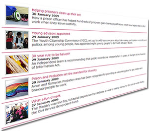
I wanted to turn this on its head and bring the news stories alive. I wanted stories to link to each other forming a thread. I wanted to eliminate the idea of an *archive* which reeks of a dark, locked away place, underground, filled with cobwebs. I saw news being displayed as a stream of thumbnails. And wouldn’t it be nice if staff could *Like* stories?
Devolved news publishing
Also on the cards was a plan to devolve news story publishing to the internal editorial team. Up until this point, the central intranet team handled all intranet content, coding up and publishing manually in Dreamweaver. To get the news stories flowing through the new intranet via the editorial team, we needed a CMS (content management system). And because news would appear on the intranet homepage, it meant that the CMS would have to publish the intranet homepage. Scary, because we’d always had manual control of the homepage.
Technical development starts
Armed with my wireframes and a visual design prototype (built with Fireworks – great for WEB graphics) it was time for the core team to come together ready for the build. Up until this point I had been working very closely with the intranet development manager. Nobody had seen any visual design work or prototypes. This was the point when I presented all my findings to the team and we got our heads together working on the interface.
We had two developers who would build the HTML and CSS template for all sections of the intranet. Then two CMS developers to take the template and build the homepage and news delivery system within the CMS. And I stress again, we were working with a webserver that just supported flat HTML and Javascript on IE6+ browsers.
Team meetings were more scrum than SCRUM and I was probably seen as a tiresome pain in the neck during development. Constantly tweeking parts of the interface. Trying to defend usability design choices. Causing hell for the CMS developers whose inbuilt navigation system would not bend to my contextual designs and pushing them to the limits of programming creativity. Trying to turn their mindsets to new ways of thinking. I still remember roaring at the team during the news section development “THERE IS NO ARCHIVE!” and fighting for pixelspace on the width of the search box. Such is the life of the user experience designer.
Compromises, battles won and lost, we came up with the following main design elements.
Page layout, consistent design & colour coding
We decided that the header bar should stay the same throughout the intranet. This contained the logo, strapline and search box (including people search). Plus a global navigation bar containing the top-tasks and A-Z lookup pages. I was quietly pleased that it would leave no possibility of having any spam banner ads forced upon us from overly keen stakeholders.
The left-hand menu on the homepage displayed the top 4 sections.
I added an A-Z box to the homepage to give quick access to any letter plus a scrollable billboard space for internal advertising. The billboard gave the user 10 seconds to do what they came to do from the homepage and then started slowly scrolling the adverts for those who hung around. We managed to get RSS feeds from our public site and the BBC into the homepage and the only bit of personalisation on the intranet; a graphical bookmark link back to a choice of local intranets (implemented with cookies).
We changed the default typeface, increased the font size and line-spacing and improved text flow on the page. We used a three-column approach, left-hand menu, body content, right-hand for document downloads, related pages and external sites, adverts and contact information.
News stories
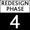
On individual news story pages the developers came up trumps allowing us to display popup images, scrolling photo galleries and video. A big plus for engagement. And we managed to get voting on stories into the mix through a convoluted use of jQuery, cookies and Google Analytics to store the votes. We added *next* and *prev* on each story to encourage paging back and forth between stories. Back issues were still organised by month but we now had a visual display of stories using thumbnails. And there was no mention of archive 🙂
User-centric dates
Working interface
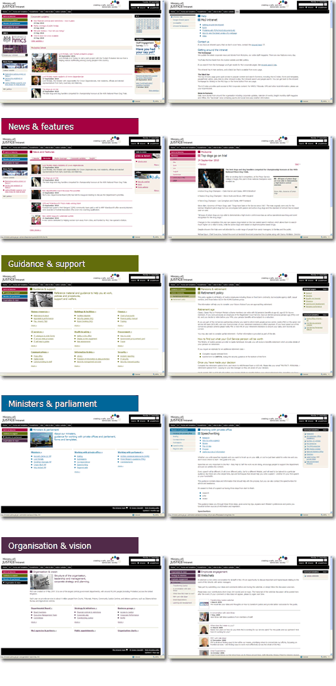
Here are some example thumbnail images of each section template, showing the homepage, a help page and then each section landing page paired with a themed detail page. Not counting news & features, each section landing page acted as a partial sitemap giving quick access to popular content within sub-sections.
Accessibility testing
It was at this stage when the first drafts of the site had been built that I tested the intranet template on staff using assistive technology. I sat with people using JAWS and SuperNova screenreaders and Dragon voice recognition. Always a good experience watching (and hearing) the intranet being used from this side of the fence. And great when all the hidden code in the back of the pages works. However, I sat with one blind lady and I was pretty gob-smacked to find out that she was not aware of access keys and how to jump around the site. She’d been relying on her own method of jumping to the H1 tag on a page but was unaware of all the other shortcuts. It was also interesting to sit with another lady using a headset to easily browse the intranet through spoken commands.
After building the templates and CMS system we were then ready to haul over the content, which I’ll cover in my next post.
In this series
- Research, surveys and brief
- Information architecture and content audit
- Wireframe designs and user testing
- Visual design, HTML and CMS build
- Migration, content freeze/dual publishing
- Communications, launch and evaluation