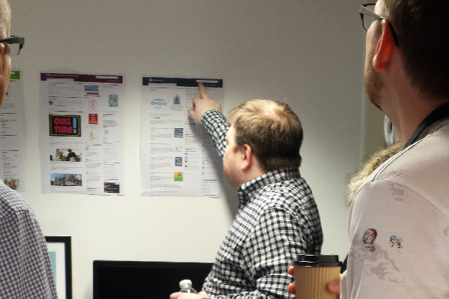
Last week, we held a breakfast meeting for our intranet clients from government departments and agencies, councils and charities. The breakfast meeting was an ideal opportunity to compare and contrast how they use the GovIntranet theme and to share ideas and experiences.
The meeting took place at our office in the Clerkenwell Workshops where we have just enough room to comfortably accommodate around a dozen people. We displayed paper printouts of intranet homepages around the office and we have an Apple TV screen to airplay live demos.
This was a very informal meeting. No speeches or presentations. Open between 8.30 and 10.30 for clients to drop in. I was prepared with a list of topics to cover should there be any awkward silent moments, but by 9.00 the majority of our invitees were present and the chatter and general hubbub was in full-flow. In fact, it’s very hard to stop intranet managers from voicing their opinions and showing off their intranets.
Search
“The Search Box” was a common topic of discussion. Some staff just don’t use the search function, and there were various opinions as to why, ranging from general distrust of search due to years of poor experiences, to simple banner blindness. I’d definitely like to explore this further, perhaps with some A/B split testing.
On most development projects, be they website or intranet, I generally have to negotiate to make the search box more prominent, or in some cases just for a search box. During development of the GovIntranet theme I made sure that there is a visible search box, position top-right where people expect to find it. When content is written well with good titles and appropriate keywords, the search engine works really well. The overwhelming positive feedback from our latest intranet launch has been on the subject of the search function. It’s disappointing to hear that staff are missing out on this helpful feature.
Jargon buster
There’s a firm divide between use of the jargon buster module. Some organisations are making extensive use of this to explain acronyms and commonly used jargon in the workplace. Others feel that this only encourages the use of acronyms and jargon on the intranet and would rather concentrate on stamping it out.
Homepage layout
Client homepage layouts begin with a default configuration showing news and blogs in the left hand column, most active and most recent content in column two, with forums, events and twitter feeds in column three. Most intranets have stuck with the simple choice of main menu options including About, How do I? and News. Some also have a Home option. I’ve kept screenshots from client intranet homepages at launch and at subsequent points throughout their development. There are some patterns to their evolution.
Most active
The “Most active” widget is a feature of GovIntranet that pulls in live data from Google Analytics in order to show what is trending on the intranet. There are options to set how many items to display, how far back to look, and which types of content to show.
Some intranets stay pretty much fixed to the default configuration showing the seven most popular tasks in terms of unique page views, trailing the last three days. This is the combination that we found to be most effective when testing the DCMS intranet. Seven options allows the consistently popular tasks, such as booking a meeting room, to take root in the top three or four spaces in the list. Seasonal or topical content can then bubble up throughout the year, such as performance management. Trailing three days ensures that the information is “realtime” for the current working week.
Some client intranets don’t use the widget at all. I *think* this is through fear of what might appear. I always tell the scenario to new clients of how open and transparent the DCMS intranet was on launch, when the resignation guide was the most popular task on the intranet.
On other client intranets I notice that the “top tasks” area is gradually taking a demoted position further down the homepage, generally in favour of ongoing HR and IT promotions.
And I’ve spotted one intranet where there’s only three items on the most active list. It’s my prediction that this will only serve to create a self-promoting list of links that will never change.
I was interested to learn that intranet managers have used this widget as a method to dissuade fervent requests for links on the homepage. The message to departments wanting to promote themselves is clear; if staff really are interested in your content then it will appear in the most active list.
News
More areas of the homepage are becoming devoted to news. What started as a simple news listing has evolved into a larger set of content types and taxonomies to support the different flavours of news required for central and local government organisations. I’m now seeing mini-listings of alerts, updates, IT announcements, HR announcements and building announcements. While, in addition to the regular news listing, that sounds like a lot of news, the widgets are designed to appear and disappear as specific types of news are available. So, if there’s no building-related news, the area on the homepage is freed up. In theory you shouldn’t see masses of listings at one time. However, this relies on managing these types of alerts well and ensuring that they are only published for as long as necessary.
Ongoing development
Our group of supported clients have all participated in the development of the GovIntranet theme and I look forward to working with them as we develop the ongoing roadmap for the theme. Until now, I’ve been the only person with a birds-eye view of how the theme is being used across the different organisations. The breakfast meeting has given them all the opportunity to have that viewpoint and will hopefully encourage further ideas and developments.
Further reading
Mental models for search are getting firmer


