 Here are some common signs that your site content has been written by someone who has never been trained how to write for an online audience and is unaware of search engine optimisation or visitors using accessible technology.
1) The page title of you homepage is “Home”
The word home, on its own, as a search result or in a browser tab title, doesn’t tell me anything about who you are or what you do, apart from the fact that you can’t be bothered to introduce yourself correctly.
2) The page title of your about us page is “About us”
About who? I still don’t know who you are.
3) The first word on your page is Welcome
What’s the most important thing that I might want to do or need to know on this page? Put that first.
4) You write long introductory paragraphs of detail about what you do on your main section pages
I came to your section of content because I wanted to do something. I don’t want to hear about everything you do, how you do it, why you do it, how well you do it and how you’re trying to “serve my needs” every time that I visit your section. What’s the most important thing that I might want on this page? Put that first.
5) You use capital letters in your page headings
It’s hard to read lines of capital text on a screen. It really won’t get more clicks in search results. And it’s considered rude to shout online.
6) You use underlined text to emphasise what you want to say
Online, underline means a hyperlink. Don’t use it on HTML pages or in documents.
7) You use bold text for section headings
Use HTML heading tags H1, H2 etc. and document styles Heading 1, Heading 2 etc.
8) You’ve never accessed the File, Properties menu in Microsoft Word
This is where you enter your metadata. Page title, keywords, description. Takes about 20 seconds to do. Makes a helluva difference.
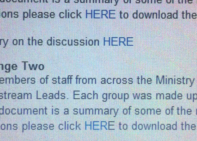
9) You mention a document in your page text and then write “To download it click here”
Most people scan web pages when they read online. An underlined link that reads “Click here” makes me have to wade through the surrounding text because there is no indication where I will go if I click here. Link text must be descriptive.
10) To update an existing document, you add a new document
By leaving older versions of documents online you make your visitors waste time in trying to find the correct document and risk people using the wrong document. Use the existing filename/URL so that links don’t break and visitors can return from bookmarks and other sites.
11) You take a graphic, slap it into a page or document, then resize the graphic
Compress images to get a balance between the smallest file size and best image quality. This means using the most appropriate graphic format and working to precise pixel dimensions. Smaller files means faster downloads means happier visitors.
12) You use your own favourite typeface and colours so that your content will stand out
It will. Especially if it’s 24pt Comic Sans in Barbie Pink.
Related posts
- Intranet publisher training course outline
- Shelf-stackers in the intranet supermarket
- Search engine optimisation common mistakes
