I like the idea of allowing staff to create and post corporate content on the intranet. But, in my experience, the idea hardly ever works well. It’s essential that publishers know how to create effective online content. Devolved publishing makes it difficult to maintain consistent quality, structure and findability.
Centralised publishing

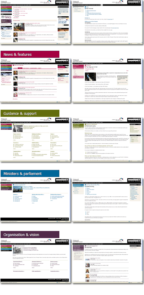
Communication professionals produce the corporate announcements and news stories for our intranet. The style for news articles is short and clear. The content gets to the point and, where possible, leads readers deeper into the meaty intranet guidance pages.
The meaty information is supplied by other departments, and before it makes it onto the intranet it undergoes a bit of sense-checking from the digital team (who are also communication professionals.) They will advise on the content structure and suggest rewrites and SEO tweaks before they go ahead and publish.
These meaty guidance pages are the core of the intranet. The look-up information, the how-to guides, the statistics and policies and forms. Due to our processes and relationships between the different teams within the communications department, the intranet content is well-organised and well-written. We police the intranet quite strictly. And as a result our pages are consistent in look and feel, style and layout.
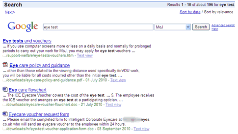
Our Google search engine works really well. We index HTML pages plus associated PDF and Microsoft Office documents. Search results are crispy clean. Most people find what they want on the first results page. We know this from our analytics.

Devolved publishing
But about a year ago, we were asked to develop a system of devolved publishing to replace the Human Resources section of the intranet.
Human Resources is, by far, the most popular area of the intranet. It contains all the information that is most dear and most personal to staff; pay, pensions, sick forms, maternity leave, annual leave, training and claiming expenses, as well as more sensitive topics such as bullying, performance improvement plans and whistle-blowing.
Development
Over the past year we’ve been working with our HR department to create the CMS system for them. I designed and tested the existing HR intranet information architecture as part of the 2010 intranet redesign. It was pretty easy to fit the new HR content into the existing structure. The only difference that I had to build in was a staff and a manager version of each page. I opted to use tabs, which fit well with Jakob Nielsen’s rule of using tabs to alternate between views, within the same context.
After months of development, we released the CMS to the HR department. We spent a day training the publishers how to use the CMS and how to name files and add metadata. They went away with a personalised user manual, armed to start building their content which would replace the existing HR section.
Pilot testing
When the content was complete, the HR department used a pilot group to test the new section with around 3000 people for two months in a ring-fenced area of the intranet. During this time I moved onto our website convergence project, having signed off the new HR navigation structure, leaving the HR people to make content updates.
Go live
The new HR guidance area went live in April, designed to go hand in hand with a new online HR self-service transaction system. The self-service platform was developed outside the digital team using an Oracle platform, in a drive to save money, and streamline and share internal processes.
And I’m not impressed with the results! I had a few days off work with a throat bug last week. I tried to fill out my sick form this week. Apparently it’s now called a return to work form. And it doesn’t exist on the intranet. I easily find the sick absence page (this still remains from my IA design!) They talk about the form. They instruct me to fill it in. But I can’t find the form. Not in the links on the page. Not in the search results. I even look in the back-end folders in an attempt to get my hands on it. No luck. So I assume that with the new self-service system I will be able to fill out my sick form online. How fabulous! This is what modern intranets are supposed to offer. An online, automated system where I can fill out a form for my manager’s approval and it all magically goes through to the HR department for processing.
Yet I knew in the back of my head that I wasn’t going to enjoy this experience. The system was designed by “IT” people. It uses some big brand product that will offer bugger all flexibility in interface design. And, even though I managed to login successfully, I still couldn’t find out how to do my sick form. Nothing at all about sick absence. Loads and loads of drop-down menus filled with codes that I don’t understand. So I ask my manager if she needs to request the form for me somehow? No. She can’t find anything either. No wonder the helpdesk gets flooded with calls.
The search results page is now infected with excel spreadsheets titled “Sheet 1” and forms with titles like “MatB1” and “CNF1a” making it hard for staff to make sense of them.
I recently found out that while my back was turned, our CMS developer was snipered with numerous requests for change from the HR people, coming in through the back door in the disguise of “system defects.” Our developer saw the word “defect” and immediately made the necessary “corrections” to the structure. It’s disappointing when our team have delivered a perfectly good system for publishing content within an agreed content structure, that the publishers cannot then just concentrate on producing their content.
So we are left with a section of the intranet where the structure has been tampered with and the content is just not up to scratch. And I’m not blaming the handful of people that we trained to load content into the CMS. During some periods I know that only one person was battling with the constant content additions and corrections. The inadequate content is the result of human resources professionals who believe that their communication skills work just as well online as they do on paper. The badly designed transactional system is the results of IT professionals who are still in the mindset of delivering “software” and expecting the “user” to learn how it works. And when the final result doesn’t work, their response is to slap lengthy announcements on the HR intranet section homepage explaining where to find the information, and to create endless videos to illustrate how to use the system. When will people learn that testing a system with real live people in the first place saves all this patching up after the system goes live?
All too often, I see web and intranet projects being too rigidly project-managed with more emphasis on documentation and ticking boxes than doing the actual work required to deliver a usable product that works right first time. The intranet is about people; staff, employees, workers. We need to provide quality information and services for them. Fortunately, the intranet doesn’t have a start and end date that can be nicely squeezed into a project timeline; it is alive with the ebb and flow of content updates, additions and improvements, campaigns, corporate messages, experiments and realignments. And as such, it gives us all the chance to make mistakes and put things right. But the HR content is “owned” by the HR people so the best I can do is advise. Next steps for this popular area of intranet content is to smarten up the information, make sure all the necessary forms and documents are available, and go through every document to check SEO metadata. And it would be a good idea to revisit the self-service system and integrate it more into the intranet.
Whether devolved or centralised, communication professionals who supply content for the intranet must be digitally-aware. They need to know how to write and layout pages for online reading and how to optimise documents for the search engine. They could also adopt the idea of testing and sense-checking their content before going live.
I have seen a devolved publishing intranet model work very well when I worked on the London Underground intranet with a tight group of well-trained, well-managed and engaged publishers. But even here, I’ll never forget in the early days, the proud publisher who posted an animated gif of his revolving head, and the guy who thought that never-ending cascading menus were a good idea for accessibility.
