Just got back from day 1 of Usability Week in Edinburgh. Thumbs up for todays session on designing websites for mobile usability, by Amy Schade, who got us through 188 slides and kept it fascinating all the way.
I’ve been working in the field of usability and user experience for over 10 years now but I don’t have much professional usability experience when it comes to mobile. Today’s session was informative and useful. I’ve come away brimming with ideas and also feeling a little chuffed at how we have done with our freshly released version of the website which has been designed for mobile users in mind. I was a little concerned about whether we had made the right choices with some points in the mobile design. But after today I feel that we’ve made a very good start in getting the website into the mobile arena.
Responsive design
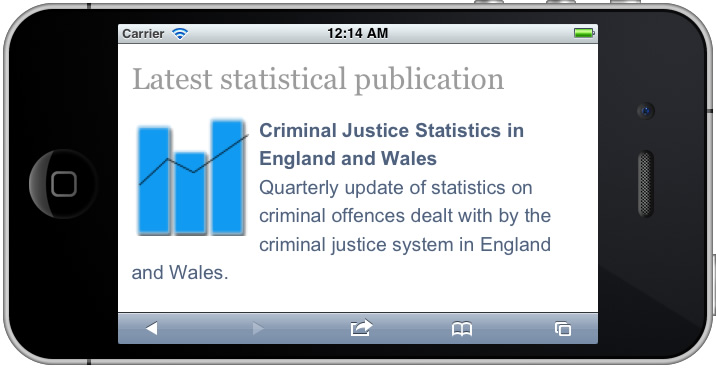
The choices when designing a mobile website are whether to do nothing and let your website look exactly the same but smaller on a mobile phone, to go for a full-on and separate mobile version of the site or to use responsive design which allows pages to reformat themselves depending on the device used to view them. Of course, there are apps and web apps – but we’re talking websites here. We opted for responsive design so that we can repurpose the same website on desktop, tablet and smartphone devices. This is convenient for us, with limited resources for maintaining several different versions of a website. But on the down side, it does mean that some content remains in the full-website format, when it could be cut down for mobile reading.
From the start of the website redesign project we wanted to retain the ability to view the full website on a mobile phone, in addition to the responsive design version. So it’s good to know that this is recommended for mobile sites. But we have positioned the link at the top of the page and it’s recommended to go at the bottom – which makes sense as it’s not one of the most important things fighting for space at the top.
Navigation
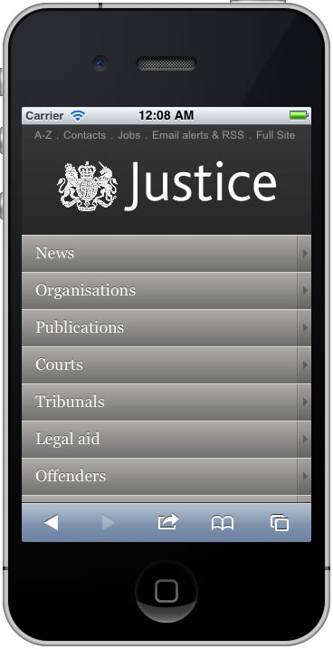
There are 3 popular ways to approach navigation on the homepage of mobile sites; a menu button that expands, a horizontal navigation bar or a homepage hub approach; or a combination of these. We went for the homepage hub approach which lists the main site options on the homepage and is appropriate for sites that have deeper structures with varying topics of content and task-oriented sites. It means that you have to return to the homepage to start looking at another topic or task, which is fine for our users who typically use discrete areas of the site.
at bottom of page
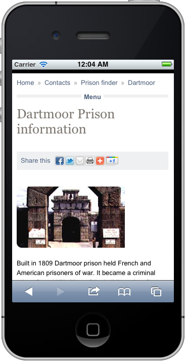
I was keen to find out if our treatment of regular navigation throughout the rest of the site had been done well. We use a “Menu” link at the top of every page which skips to the menu navigation situated at the bottom of the page. There is a “Top” link situated with this navigation block at the bottom which returns you to the top. This technique was first seen in accessible websites to allow users to jump around the page between navigation and textual content and it’s nice to see the technique used again, showing yet again that designing for accessibility makes for helpful navigation for all types of users. And according to NN/g this is an appropriate application of navigation because it promotes content at the top of the mobile page and still allows people to quickly navigate through the site.
User testing
There was also a session on user testing of mobile websites which gave me some good tips such as how to go about recording testing sessions, what equipment to use and how to avoid pitfalls like recording someone using a mobile phone only to find that all you’ve recorded is the glare from an overhead light on the surface of the phone.
Future development
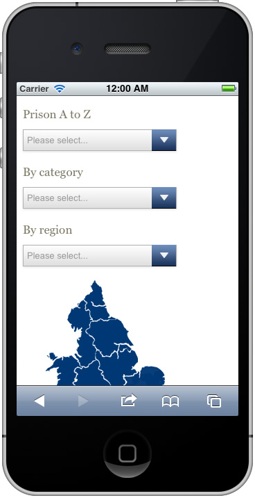
There is more that we can do to the mobile version of the website in terms of flattening navigation structures and minimising clicks (or taps). And maybe even a case for developing web apps for some of the more popular areas that are used by mobile users – things like contacts, job search, find a prison, maps and localised content provision.
I’m very much looking forward to the rest of the week when I’m attending a few more tutorials on mobile and touch, plus some more psychological learnings.