
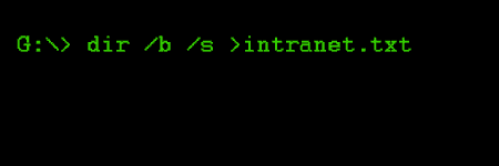
Back in the good old days when the IT department allowed me to use DOS (the operating system that I was brought up on,) I managed to do some jiggery-pokery and get a complete intranet file-listing. And a few deft keystrokes later, I was spreadsheet-a-go-go.
Content audit
My previous analysis already told me what was popular content on the intranet. The spreadsheet gave me the complete picture and what kind of state it was in, structurally.
Using our Google Search Appliance, I also generated a listing of all content that Google thought was on the intranet (having crawled from the homepage.) The resultant list contained 6416 entries (HTML, DOC, XLS, PDF) and was a fraction of the DOS listing, meaning that the webserver was filled with rubbish, albeit invisible to staff.
I then spent a long time sifting and sorting, grouping and batching, slicing and hacking. By the end, I had a good idea of what I was dealing with and what would make it into the final mix.
Top-level navigation
I decided that I could group the whole of the intranet into just 4 main sections. Big change. Big simplification. What I didn’t know for certain was what I was going to call these sections. So, with the core team, we came up with a good handful of ideas for the names of each of the 4 sections.
I started involving staff with an online, closed cardsort using all of our ideas for names. I invited staff from all over the organisation to take part. I tested a representative selection of all intranet content. The tests worked by showing the participant an intranet page or document and asking them which of 4 boxes they would put it in. Each question tested one section and the 4 boxes were labelled with a selection of names for that section.
I wanted to test a lot of content, against a lot of possible names with a lot of people, online. I had to find a way to distribute many smaller tests, testing different variations of sections with content while keeping the number of questions to a minimum, to encourage staff to complete the test. I was also working with a webserver with no coding capability (PHP or ASP). So I developed a simple set of HTML pages, which linked from question to question while passing the chosen answers to Google Analytics. I’d be able to filter the analytics for the test questions and answers.
For the intial test page which all participants landed on, I used Google Website Optimiser, setting up an A/B test which redirected participants to one of 12 different pages. Each of the 12 pages started an individual test containing 20 questions. The purpose of Website Optimiser is usually to find the best combination of elements or wording on a page to drive a particular outcome. In this instance, I just took advantage of Website Optimiser’s method of evenly distributing tests.
We advertised for participants across our family of intranets and got a really great response.
Cardsorting stats
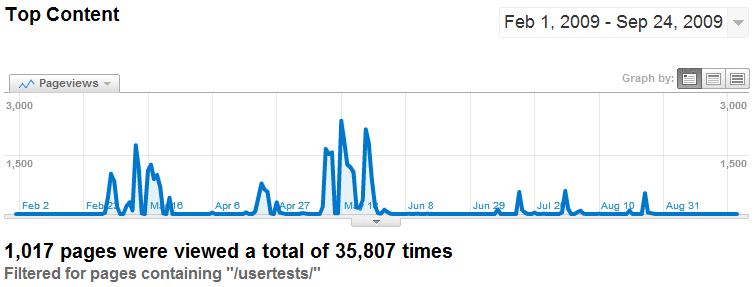
I like looking back on these analytics. During the online cardsorting sessions I covered over 1000 content items and got nearly 36,000 individual responses. The first batch of tests was in February, designed to elicit our main navigation labels. Subsequent tests then checked that the chosen names would suit all the intranet content. It was a much larger set of tests, again using Website Optimiser for distribution and Google Analytics to capture results.

The “Test tube advert”
Cardsorting results
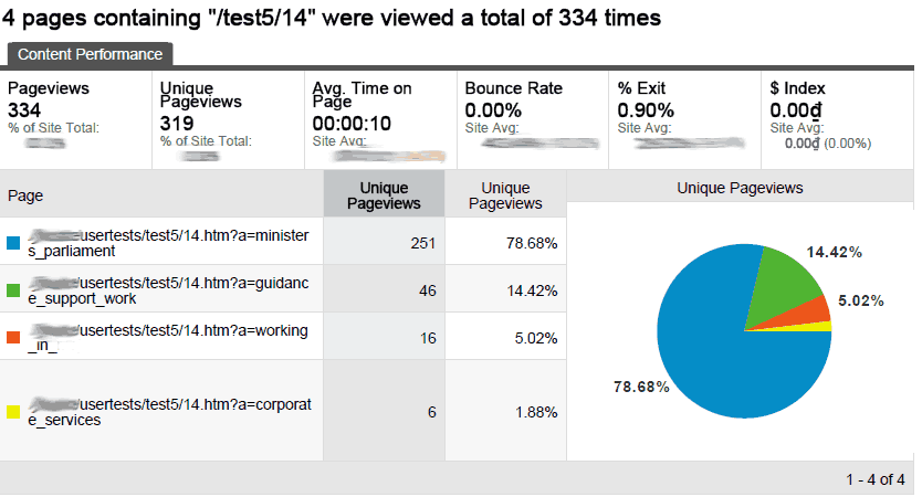
The stats from the cardsorting gave a clear visual indication of success or failure. Here is an example of results for a single card with the option of 4 placements (boxes). This card got 334 responses with nearly 80% concurrence of opinion. I tested iteratively until I was confident that everything fitted and would work well with staff.
Remaining information architecture
After the cardsorting exercises were finished I then got to work on creating the master IA for the intranet, creating the secondary and subsequent navigation levels. I could then map the initial intranet structure to the newly created structure, producing the content migration plan, ready for phase 5 of the project.
IA is such an important step in any web or intranet development project. And it is important that it is done early in the project, before any page layout or visual design.
In this series
- Research, surveys and brief
- Information architecture and content audit
- Wireframe designs and user testing
- Visual design, HTML and CMS build
- Migration, content freeze/dual publishing
- Communications, launch and evaluation