The previous phase of the project gave me 4 main intranet sections with specific content functions and a detailed map of all the content that was cherry-picked to make the migration to the new intranet. There were going to be a fair few chunks of content left ashore, and no doubt a few stowaways.
The top-level, homepage, main navigation options, as voted for by the willing and much appreciated members of staff who took part in the online experiments were:
News & features
Containing 2 types of news; corporate *must read* announcements and feature articles, promoted as the online staff magazine. In addition, this section would be home to the corporate calendar, press and media coverage, the monthly staff magazine, and our holistic section (sports, social, weather, travel, photo galleries).
Guidance & support
Look-up, reference and guidance material, policy and procedures, forms and templates. All the stuff you need in your day to day job.
Ministers & parliament
Content relating to official ministerial business. (Cardsorting put any guidance of this nature into this section, rather than the general guidance and support section.)
Organisation & vision
Content about our structure, goals, ways of working, strategies and initiatives. Promoting internal campaigns.
Contextual navigation
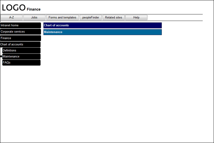
For this next phase, I ran some time trials, using 2 sets of wireframe prototypes (created in Axure) to test the existing navigation against the proposed contextual method. I created a set of tasks for face-to-face user testing, designed to bounce the participant around different sections of the site. Contextual navigation came out way ahead, with task completion times significantly faster than the existing method. Decision made.
I was then able to document a complete intranet navigation structure based on the 4 main sections, plus a supporting section for global pages (A-Z, search, help.)
Wireframe and prototype user testing
The next step in the project was to work out how best to present all this information on the intranet, how the navigation menus would work and to start to implement some of the design ideas from the project brief.
I spent a month making heavy use of a trial version of Axure (are you getting how many cost-effective tools were used in this project??) to create protoypes using the full intranet IA, implemented with the proposed contextual method of navigation.
Having spent some time setting this up in Axure, the product really came into its own when I started the iterative testing. I’d do short bursts of tests with just a handful of people, individually at their desks. Glaring problems immediately came to light and with a few adjustments in Axure, a press of a button gave me a new prototype in seconds. Then more testing and adjustments, round and round, until I was confident in the navigation and layout, and just before the trial license ran out 😉

Note the drippy *Corporate services* label which
crashed and burned in cardsorting as a possible name.
Benefits of contextual navigation
Bye bye breadcrumb
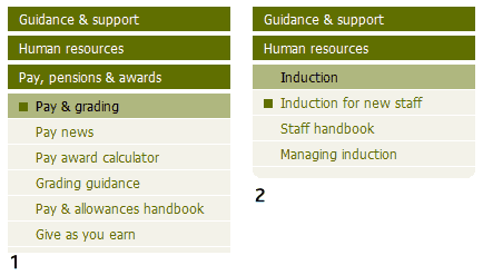
I also got the idea that the left hand menu could double-up as a breadcrumb, always leading back to the homepage and always showing you the path you have taken. An added benefit (later implemented with colour coding) was that the menu acted as a depth gauge. The less darker menu colours, the nearer you were to the homepage, the more darker colours, the deeper you were in the structure. Removing the traditional breadcrumb that spans across the top of body content saved some screen space and would also speed up migration time since developers would not have to manually code breadcrumb navigation.
Flexible menus
I was very optimistic about all the benefits of switching to this type of navigation It is flexible. It is not rigid. But I found this the hardest part to explain to the developers who were stuck in a rigid mindset of using up to 3 levels of navigation levels and no more. The intranet is not an evenly distributed field of content that falls neatly into ordered layers. Some sections go deep. Others are shallow. But, most are a combination of both. Sections consist of sub-layers of varying depth. So it is illogical to try to force the structure. To try to make it fit. Or to limit the structure to a finite number of levels.

made from the following building blocks:
I can go back to this page/section (dark shade, one or more of these)
I am in this section (medium shade, just one of these)
I can go forward to this page/section (light shade, one or more of these)
A bullet point marker to show *I am here*
Information and navigation design completed, I then moved on to visual design, which I’ll cover in my next post.
