Analysis of original search experience
I so wish I had some screenshots of the original search results pages. If I manage to find some, I’ll post.
Back in 2008, a typical search from any one of the family of intranets produced results from all the intranets. I know it is considered best practice to include everything in the initial scope of a search and then allow users to winnow down the results. But in this case, because each intranet served a very specific part of the organisation, results from all intranets clouded the experience. Inadequate metadata and file names made the experience worse and the interface was generally busy, as if someone had got into the admin page and turned on every option. Just because you can do something, doesn’t mean you should.
Search interface redesign
For the interface, I decided to localise the results and narrow the scope of the initial search to the intranet that staff search from. I thought that it would improve orientation. So if I search from the HQ intranet then I just get results from the HQ intranet. Same goes for intranet 1, 2, 3…
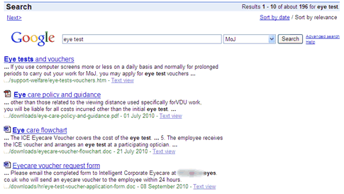
For the results page I included the Google logo to psychologically increase confidence in the results. I placed a nice wide search box at the top, pre-filled with the original search phrase to allow staff to easily refine their query. I used a drop-down menu so that staff could switch to results from a different intranet. The presentation of the results themselves also followed Google’s public design with a title, snippet, URL and links to the cached version.
I decided to use icons for downloads instead of the existing [PDF] text that came by default with the GSA template. The template also included the amount of time it took to fetch and display the results, which I dropped in favour of simplicity. I changed the *Cached* link to *Text view* in the hope of encouraging staff to use this is a quick method of viewing PDF and Word files in a text version rather than waiting ages for the application to load.
Advanced search is available, but inconspicuous, since my experience of watching users try advanced searches is that they tend to overly restrict themselves. I also rewrote the help page.
The results display by relevance with the most relevant at the top (I’ve never understood some websites which clutter the search results page with a relevance or significance scale against each result; surely the first result is ALWAYS the most relevant?) There’s also the option to sort by date.

GSA backend tweaks
In addition to the interface, I also had a play around with the backend configuration with the aim of improving search quality, relevance and general usability.
Date stamping
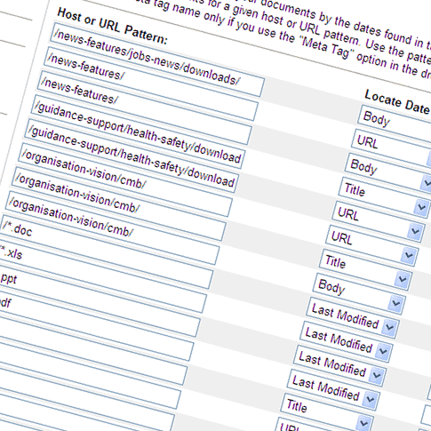
For each entry on the search results page there is a date. But what does the date mean? It is not always the date when the page or document was last amended. Consider a date-specific news article that is published and then gets amended several months later. Which date do we show in search results; the date of the article or the date is was last amended? This is just one question that I had to face while tweaking the interface. It’s possible to extract a date for inclusion in search results from the page or document title, filename, URL, from within the content itself, from metadata or the file datestamp. That’s a lot of choices. Our search result dates are contextual so that if you see a news story, the date reflects the initial publishing date. If you see minutes from a board meeting on a certain date, that’s the date we’ll show.

Manual biasing

Date biasing
Crawl frequency and freshness

Related queries
This is a manual method of promoting alternative or related queries. I don’t use it much since Google does a great job of serving results. I mainly use it where there is problem with internal office language with projects which insist on calling themselves one thing when everyone else knows it as something else. Clicking the alternative suggestion will perform another search.

Key matches
Another manual method of promoting results. Key matches differ from related queries because clicking the suggestion will take staff directly to the intranet page rather than performing another search. Again I don’t saturate staff with these but I do use it for staff who come to the HQ intranet expecting to find popular items on their local intranets.

Query expansion (synonyms)
The GSA comes with a default set of synonyms, in different languages. Unfortunately, the UK set comes with American spellings so I had to change all the -ize, -ized, -izing to -ise, -ised, -ising. Again, I use this functionality for dealing with problems with internal language. Query expansion differs from key matches and related queries in that the GSA will incorporate the expanded search terms into the initial query. Example: I search for *organogram* and GSA will also include *org chart* and *organisation chart* into my query and return any results containing those terms.
Content metadata
The remaining improvements to the search experience rely on the quality of the content that Google is crawling. I spent weeks going through a good proportion of the HTML, PDF, DOC, XLS and PPT files on the intranet, getting the metadata into shape.
I posted last month on the importance of quality metadata, with examples of what happens if you don’t think about metadata:
Since the launch
As we publish more and more content on the intranet it is a constant battle trying to maintain the quality of search results. However, the importance of metadata is slowly but surely becoming embedded into our processes. We are still using an older version of the GSA (version 5.2) so we don’t have the advantages of any of the newer developments such as type-ahead search results and allowing staff to tag and rate results. But I believe it’s important to get the basics right before adding the frills.