A/B testing can help to pinpoint the type of content that staff are most attracted to. I ran an experiment to find out which advert was most effective in an internal campaign.
The problem
The intranet staff directory gets a lot of complaints.”It’s never up to date,” being the main one. Last year, we ran a campaign to encourage staff to update their records. Incidentally, our intranet staff directory is not linked to any central human resources databases or Outlook contacts. We are stuck with a system designed outside of the central intranet team and the best we can do is to try to keep the information current.
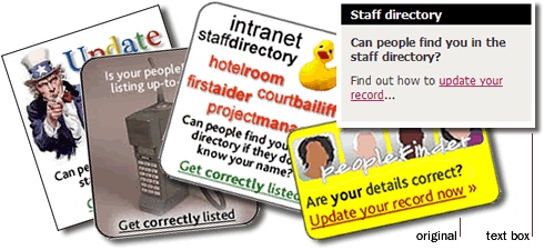
On occasion, we have previously used a standard graphic advert (the yellow original) to encourage staff to check their directory details. It wasn’t a great advert and it wasn’t very effective. For this latest campaign, I decided to test the original advert against other variations to see if they sparked any interest from staff. I designed a series of adverts with different themes, some static, some animated and one plain text advert. I ran the test over a period of weeks to find out which was the most effective at encouraging staff to take actions to update their details.
Setting up the test
I used Google Website Optimiser to handle the A/B testing. I ran the adverts on the page where staff would normally go to search for phone numbers and configured Website Optimiser to serve the various adverts, using the original yellow graphic advert as the control. I defined a successful conversion as a member of staff going to the “How to update your record” page and clicking on the option to update their details.
Testing process and results
Website Optimiser works using cookies to serve one of the predefined adverts to a visitor. It will always display the same advert to the same visitor. It then measures how successful each advert is depending on which actions the visitor takes.
After a few weeks the numbers in Website Optimiser should start to solidify and you begin to see patterns in the results. The coloured lines show the conversion rates for each advert. This is a great visual tool for getting buy-in from stakeholders; the infographics clearly show the outperforming tests.
In this test, the plain text advert was getting the best conversions and showing up as the likely winner. The last stage in the testing process is to do a follow up experiment using just the original control advert and the proposed likely winner.
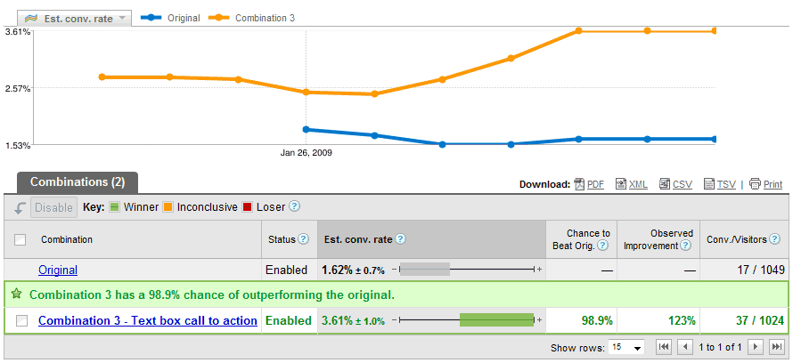
It’s very satisfying to see the green light that signifies the end of test and a definite winner. Up against all the fancy graphics and animations, the plain text advert had a 98.9% chance of beating the original.
The experiment showed that the text advert was the best approach to take for this problem, for our staff on our intranet. With user testing, the results are often unexpected, reinforcing why we must always design for the user.
See also:
- Anne Holland’s Which test won?
A blog with regular posts showing outcomes of A/B testing.