Companies invest time and money in campaigning, advertising and link-building with the aim of drawing visitors to websites. But if visitors arrive and then hit the back button, that’s an awful lot of waste.
I had 15 minutes to do a quick UX evaluation and optimsation of this campaign landing page. The goal of the site is to get pubilc responses to a green paper concerning punishment, rehabilitation and sentencing of offenders within the criminal justice system.
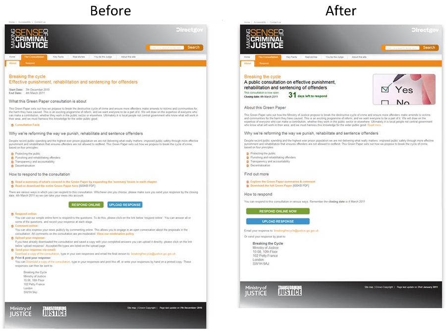
My initial thoughts were that the original was uninviting, text-heavy and confusing. The consultation is aimed at the general public as well as practitioners, yet anyone visiting from a link on another site faced a heavy load of text to wade through and many links to choose from. The options for responding were numerous, with various online and offline methods.
I proposed the following changes:
- Make the heading bolder and explain more clearly what the page is about
- Add a countdown ticker to highlight the time limit
- Add a positive graphic
- Reword text headings to be shorter
- Explain more clearly how to respond and simplify the choices
- Remove surplus information which is not required until later in the process