 Where I work, we don’t have usability labs, eye tracking equipment or even webcams or screen capturing software to test information architecture designs with people. Resorting to budget user testing techniques can still provide valuable insights which in turn create recommendations for improvements.
I’ve had two days of user testing this week, both in-house and out on-site. I’ve met people from the police force, probation officers, lawyers and barristers and more. A good mixed bag of users from different sectors and it’s also nice to do testing where people usually work.
The in-house testing consisted of half hour sessions throughout the day in what seemed like a production line at times, with people queuing outside the testing room door waiting for their slot.
I like to spend time at the beginning of a testing session getting to know the person who is doing the tests. Finding out about their job and which websites they use and the types of information or online services that they need. I never script my testing sessions and always to try to make the testing tasks applicable to the person sitting in front of the screen.
It’s satisfying when people complete a task. It is also satisfying to see people making the same mistakes or getting stuck in the same place during tests. Problems on the site become apparent, which means that we can iron them out before going live.
During the in-house testing, with half an hour for each participant, it got to the stage where people did not want to leave! They were actually having fun trying to complete tasks that I was setting and even though I make it very clear at the start of a session that I am not testing the person, they still go into “game-mode“, enjoying completing the tasks and the occasional bit of role playing. Most people wanted more. Some were disappointed to have to finish.
The most number of tasks that a participant managed to tackle in one session was 16. Tasks typically involve trying to find information on the site, answering questions using the site or performing a function such as ordering a publication. While participants are completing tasks and moving through the navigation, in addition to watching what they are doing, I have to write up what they are doing. One participant remarking on my notes asked me if I was counting the number of clicks. I replied that no, I was more interested in whether they could complete the task and how efficiently they could do it.
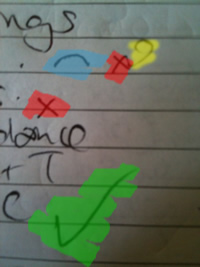
Over the years of user testing sessions I have developed a system of shorthand notes that I use. I’ve included some snaps of the notes from the testing session this week which I have highlighted with colours to demonstrate the different symbols.
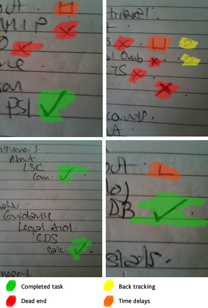
Ticks (green) represent where the participants are confident that they have reached the end of the task (I also include a cross if they have not in fact reached the end of the task). Depending on the speed of the participant, I generally try to write longhand names of menus and navigation elements, indented to show hierarchy.
Crosses (red) indicate where participants reach a dead end or give up searching down a particular route. Followed by a hook (yellow) means that they hit the back button. I also use smileys and sad faces (blue) to indicate sentiment.
I use a square block system (orange) to indicate points in the task where participants take a long time in searching or scanning a page. The length of time is represented by the number of sides to the square with the inside being filled with two diagonals when exceptionally long times are noted. I also note any observations made by the participants and encourage them to be verbal in their pursuit of task completion so that I can get a better idea of what they are thinking.
This method of writing up actions and indicating lengths of time, success, failure, sentiment and back tracking means that after the sessions are over, I can mark up each set of tests and get scores for total attempts at a task, correctly completed tasks, passes and back tracking. This helps me to arrive at an overall measurement of effectiveness (how many tasks were completed correctly) and efficiency (how many tasks were completed correctly first time). I also get a clear picture of the areas which are not working and why.
Testing this week has thrown up several key areas which need to change in order for the site to become more effective. I already changed some areas after day one and noted improvements on the second day. At the same time as face to face user testing has been taking place, I’ve also been running some online tests designed to provide further analytical information that will help to decide on final main navigation menu names.