To recruit people to our user group we ran a display advert on the website. I created an A/B test using 4 different adverts. One of them was a runaway winner.
The aim of the advert was to encourage people who use the website to signup and become part of the user group. I tested the baseline against 3 variants on other popular pages throughout the website. The baseline advert ran all the time on the homepage but the homepage is not our most visited page, with just 3% of total site visits, compared to our jobs page at 11%. So the A/B testing ran on the A-Z, contacts, forms and jobs pages as well as several other popular content areas of the site.
Here are the contenders:


Baseline [blue] The baseline advert was a text box with simple content and a clear call to action.
Variety 1 [yellow] The first variety of the advert was a graphic, showing the website homepage and touting the user group. Wording in the advert hit on the senses (take part, view, hear) and the text was centralised.
Variety 2 [orange] The second variety was similar to the first with the same wording but used a photo of a test tube. The wording was left-justified.
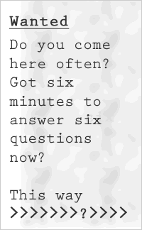
Variety 3 [green] The third variety was text-based, carefully-designed to appear like a badly-written personals ad clipped from a newspaper.
After running the test for a few days I removed one of the poor-performing varieties. After 9 days, I removed the remaining poor-performing advert and ran a follow-up test with the baseline advert and the likely winner. The total test took 12 days.
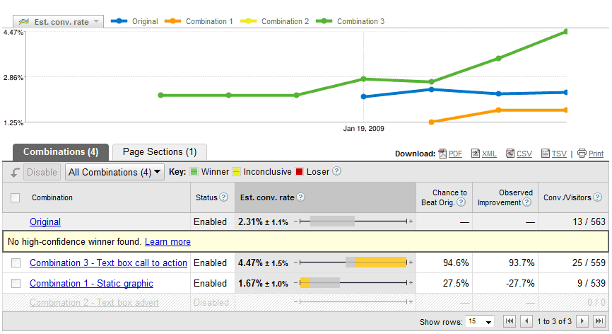
The results were conclusive, almost from the start of the test. The personals ad outperformed the other adverts with a conversion rate of 1.33%. According to Google Website Optimizer, this winning advert had a 99.9% chance of outperforming all the others. The baseline was the closest contender with a 0.48% conversion rate.
This is another test that shows how plain text beats graphic content and how users are often blind to snazzy, photographic advertising. On this occasion, both text-based adverts outperformed the photographic adverts. One could still argue that the winning advert is a graphic. But it only depicts words and characters, with a dirty grey background.