For the past couple of months I’ve been studying social network analysis through Coursera, with some truly engaging online lectures by Lada Adamic from the University of Michigan.
The course is an introduction to the analysis, not only of social networks, but the many other types of networks that exist in the real world such as transport and power networks, disease, biological and information networks. And it has given me some practical skills to turn my attention to analysing intranets.
Networks are made up of nodes and edges. In our way of thinking, nodes equate to pages or documents on the intranet, and the edges equate to the hyperlinks from one page or document to another.
Most intranet managers could probably state, or at least have a stab at guessing, how many pages and documents (nodes) exist in the intranet. But I would guess that this is as far as it goes. If I asked you how many links (edges) exist in your intranet you’d probably be stumped. I had to get my hands on some CMS data exports a do a fair bit of data manipulation in order to get the answer to this.
The number of incoming links (edges) to a page (node) is known as the page’s in-degree. The number of outbound links is known as the out-degree. And edges can be weighted depending on the strength of the connection. Google’s PageRank uses a node’s in-degree – the number of pages linking to a page.
It’s the statistical analysis of the number of nodes and edges and the relationships between them that gives us key metrics such as the average degree, closeness, average shortest path, network density, betweenness, centrality, modularity and clustering. These metrics can give usinsight into the structure, character, effectiveness and efficiency of the network.
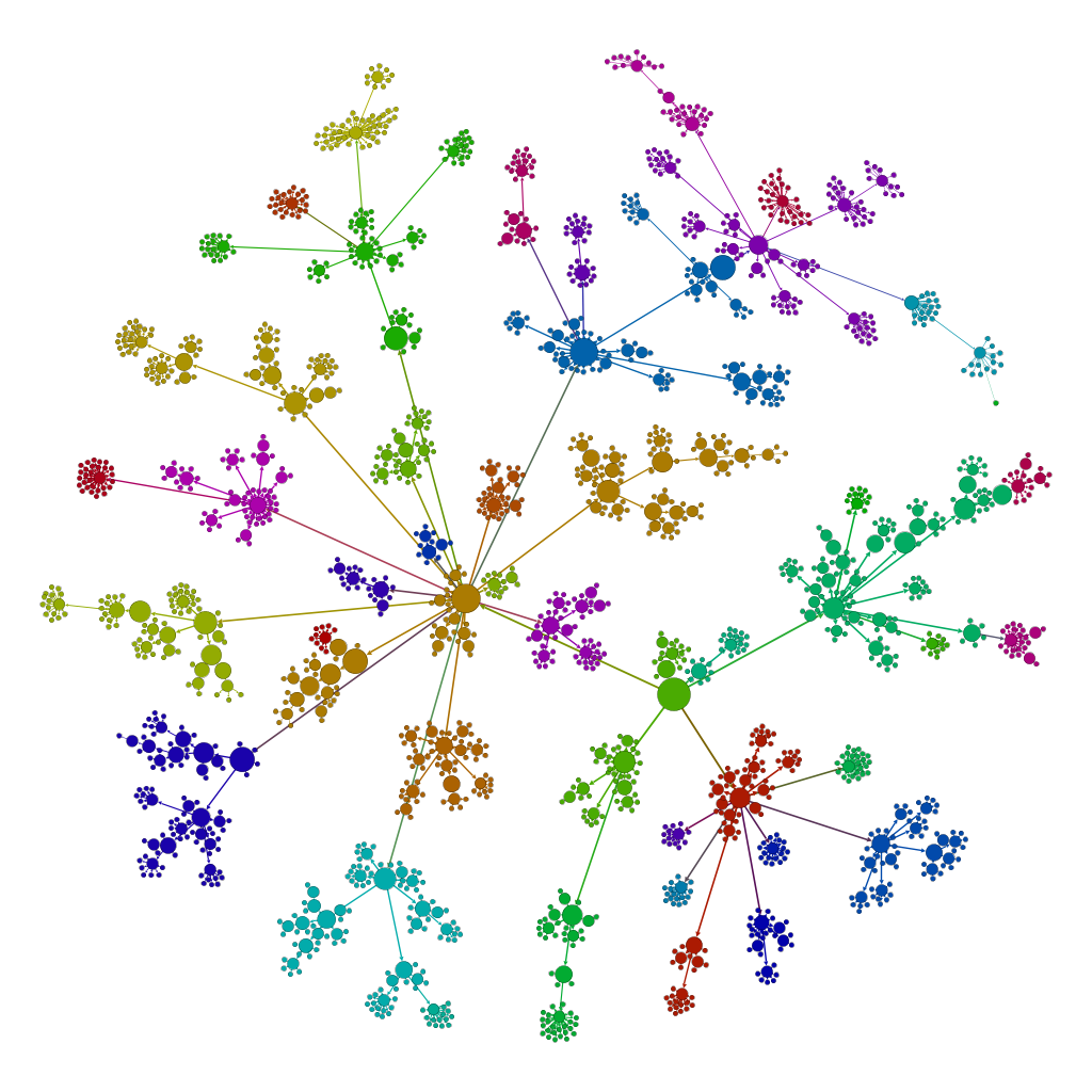
I created a dataset from the current intranet that I’m working on and imported it into Gephi which I used to visualise the network. So far I’ve only managed to recreate the hierarchical structure of the intranet, which in itself can give some meaningful visualisations. But I hope to be able to get my hands on some enhanced data including links that cross-reference sections of the intranet.
Data visualisations
Using Gephi it’s possible to run algorithms on the data and specify colours and sizes for the nodes and edges in order to produce visualisations.
Here is my gallery of visualisations showing some zoomed-in areas and some birds-eye views of the network.
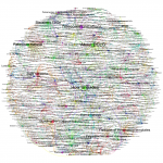


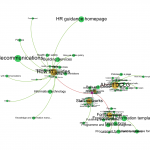


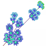
And while these visualisations are all very pretty, I’ve actually used them to support the work that I’m doing. I’ve been working on a content migration mapping document and by watching the algorithms in action I have been able to pinpoint errors in the data that would have taken ages to spot if simply working with the core spreadsheet. And this is a whole different way to show clients what the structure of their intranet looks like.
Further analysis
In addition to staff satisfaction surveys, user tests and usability benchmarks, if it’s possible to put a number on your intranet through network analysis, is it also possible to measure effectiveness based on network metrics? For example, if I hypothesise that there is an optimum number of links within an intranet in relation to the number of pages then we could analyse any intranet and judge whether it would be a good or poor experience to navigate.
If we combine actual click-through data with the intranet network we could highlight problems with the information architecture or menu navigation systems. If I know that the shortest path between the homepage and a lower level of content is 4 hops but usage analytics shows staff are taking more hops to find the content – then we can work to improve the IA and how we signpost links to content.
Gephi in action
And lastly, for those who are interested in Gephi here are some video guides for creating your own site visualisation.