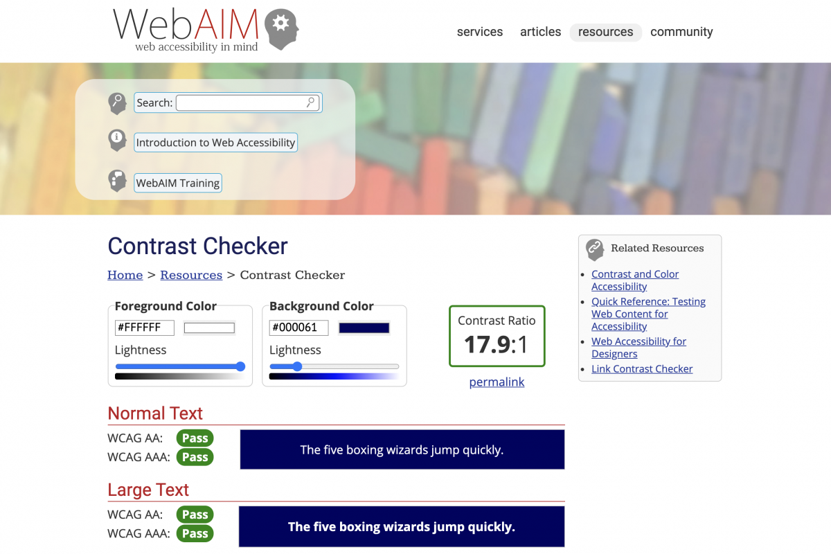
In a bid to help clients make their intranets more accessible, I’ve created an admin report to show a pass or fail for AA and AAA colour contrast checkpoints across regular and large text sizes.
The report concentrates on colours used for hyperlinks, visited links and buttons.
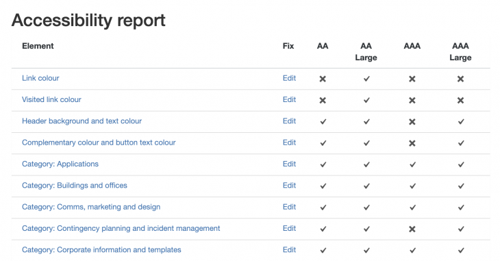
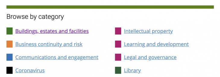
In GovIntranet, administrators can create categories and assign colours to the categories. This means that there is room for error and it’s easy to create a colour combination that is not accessible.
Colour are also used on tags, where it’s important to get the right text and background colour contrast.
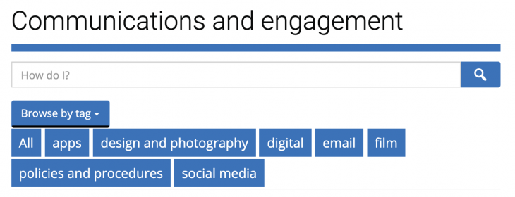
Wonderwall administrators also get to assign category colour combinations and these are included in the accessibility checker.
Finally, the report shows a selection of content that contains poorly labelled hyperlinks, such as ‘click here’.
This quick video shows the accessibility report in action:
The new tool uses the WebAIM API to check colour contrast.
