 News articles generally have three text components. Headline, teaser and body copy. As with any other intranet content, they need to be edited and tweaked before publication.
Headlines
The basic rules for good web writing and SEO apply here. Keep your headlines short. Frontload and aim to get your message across in the first few words. Don’t start with words like “A” and “The” and don’t try a clever play on words that forces the reader to think.
Here are some examples taken from the BBC website. Note how few words they use to get across a very good scent of the story behind them.
- Heroin ‘worth £10m’ found at flat
- Further swine flu cases confirmed
- Police ‘failed’ custody death man
- Medic criticises eBay drug sales
- Routine aspirin benefits queried
- Many autism cases ‘undiagnosed’
- UK transplants ‘at record high’
- Malaria parasites ‘resist drugs’
- Late abortion tribunal challenge
Of course, most intranet news headlines hopefully aren’t as dramatic as these, but you get the point.
Headlines in search results
For news listings and archive pages where headlines are seen in some kind of date context, the example headings above would work fine. As they would for the content heading on the actual news article. For search results listings, you may want to consider the date implications. News on the intranet goes stale as soon as it is published. For staff who encounter news articles through search results, it’s helpful to have an associated date near the clickable headline title.
For routine update messages which typically have the same headline text every time, dates are especially helpful for distinguishing them apart. In these cases it can help to add date context to the HTML title metadata (rather than the H1 body content heading) so that it appears as part of the headline in search result listings. Avoid words like “today” or “next week” as these won’t make sense next month.
Teaser
I like to think of teaser text as the snippet in Google search results or perhaps an informative tweet. Teasers need to provide a neat, compact summary of what the story is about. It’s debatable whether the teaser should be used as the first paragraph in the news article itself. Some say that reading the teaser and then clicking through to the news story only to read it again is wasting time. But as we shall see below, the first paragraph of the article should contain a summary of the article, since people landing on the story from a link on another intranet page or perhaps a staff email also need to get the scent of the story.
Body copy
Usual rules for online writing apply. Keep things short. Chunk up text into paragraphs. Again, avoid now-centric words like “today” and be specific about dates. It’s best to keep online articles to a digestible chunk. I’ve used a guideline of 250 words before but it depends on the organisation, type of news story and format. But remember, people don’t like to read online.
The first paragraph should sum up the article so that readers know what the story is about. Using the tried and tested techniques of writing who, what, when, where, why is a good starting point for planning the rest of the article.
If the article has anything to do with core content on the intranet, then link to that page or document. News stories should not be the place to store core intranet content such as forms, documents and guidance because news is transitory and gets shunted into the archives.
To get effective analytics I have found it best to encourage the reader to click elsewhere on the intranet from news stories and announcements by linking to another page or document or by supplying thematic tags for similar stories. Links to related news stories are a great way of increasing serendipity and deepening understanding of core issues.
If people arrive at a story, read it and do nothing else then your bounce rate goes up and you don’t get accurate timings because there is no end time to track.
Graphics
You’ll generally need a few different sizes for your images, based on the different locations that they will appear throughout the intranet. Thumbnails appear in listings. A main image appears on the article page itself, and then you have feature images which might appear in a homepage carousel or as part of full-size pop-up photos in a thumbnail gallery.
You’ll need to crop and resize your original photos and maybe apply colour correction and sharpen or blur areas to give focus and depth of field. As far as sizes go, squares and rectangles are the norm. But avoid designing feature photos to be letterbox shaped. It is really hard to constantly have to source and edit photos for a target size that does not suit the majority of digital material that is typically supplied for a story, such as portrait shots of people, signage and logos.
For composition, a great place to start for news story photos is the rule of thirds. Now an option on smartphones when taking photos, the screen is split by two horizontal lines and two vertical lines. Cropping and resizing photos to fit this frameworks produces the best results and the rule applies for portrait, landscape and square images. Check Google images rule of thirds photography for some visual examples.
Thumbnails
You’ll normally use thumbnail images on news streams and archive listing pages, and occasionally they are seen in search results. The general rule of thumb(!) is that the graphic content should be clear and obvious. Text should be large enough to read. People should be recognisable. Objects should be obvious.
People
For thumbnails of faces it’s usually pretty easy to follow the rule of thirds. Crop and resize images so that the eyes fall into the top two intersections, the mouth follows the bottom line and the face can fit nicely into the two vertical lines. It’s ok to chop off bits.
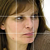
Poor rule of thirds
Shot #1 does not follow the rule very well. The eyes are centred in the image instead of being on the top line of thirds. The photo has been cropped so that the chin ends exactly at the bottom and gives a sense of being boxed in.
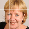
Good rule of thirds
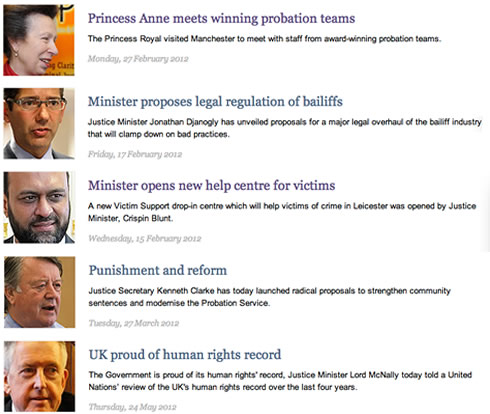
Shot #2 is much better, following the rule of thirds beautifully. And another nice touch is that the eyes are looking to our right. This is good for news stories that have thumbnails on the left and heading/teasers to the right. It’s the other way around for thumbnails on the right.
The idea is that, as humans, when we interact with other people, we naturally follow their line of sight. Go on, try it next time you’re talking with someone. If you look at something else, their eyes will follow. And the theory is that this works with these kinds of thumbnail images, drawing you in to read the headline and teaser. Of course, a listing filled with faces turned to the right will look a bit forced – but we can intermingle thumbnails of faces with other types of imagery. The listing below shows a selection of stories using right-facing faces/eyes – they didn’t originally all appear together.
Group shots
Scenes of group events or team photos work great when you have a gallery of images that you can blow up and scroll. But for listing pages and search results, thumbnails need to be treated differently.


Thumbnails that have been created by simply shrinking a full-size group photo are not effective. They produce a splurge of tiny people and faces that are not distinctive and they don’t tell much about the story – apart from it’s a group of people. In shots #1 and #2 we don’t really get a good idea of what’s happening or who they are.

(zoomed)
For groups, it’s generally best to pick a relevant/smiley face with an object that is pertinent to the story and zoom in for a closeup. Shot #3 was taken from a group shot and it’s quite clear that we’re talking about some kind of award.
In shot #1 we could have zoomed in on some of the delicious food or a candle. For shot #2 a close-up of a smiley face looking right would do a treat.
Feature images
Feature images may appear on intranet homepages, in carousels, news articles or photo galleries. Use the rule of thirds in your composition where possible. Crop and resize photos to show the real focus of the story. For group shots, make sure you supply a blow up image so that readers can actually see who is in the photo. And remember to apply compression to final images to get the file size down, and use the appropriate graphic format.
Housekeeping
A good file-naming convention and folder structure can help with the behind-the-scenes activities around news stories. Dates in URLs are a good start. You can also use keyword tags and any CMS will output the title of the article as part of the URL.
To measure readership and engagement it’s important to have web analytics in place for tracking news stories. For working with statistics and producing regular analytics reports, URLs with dates will help when you want to filter stories for a specific time period.
URLs with dates can also help when you want to bias search results to favour more recent stories.
Remove stories and announcements that have truly died after a certain date so that they don’t clog up search results. This is easy if you can set an expiry date in your CMS. For example, do I really need to know about an IT service outage from two years ago if I’m searching for information about service outages over the coming weekend?