You know that a project is going to go well when the first paragraph of your client’s brief calls for ‘focusing on key user needs and using open source platforms and technologies to deliver improved value for money.’
I wrote a case study about the new Parliament Week website, on the Helpful Technology site. Please take a look at it for the main information about the project. On a more personal note, I wanted to write more about what went on behind the scenes during the rebuild of this website.
Parliament Week is an annual, week-long set of events around the UK that has taken place for the past few years. The team who organise the whole programme had to cope with an inflexible CMS for their website, in addition to all the administrative tasks of running such a site; liaising with partners, managing online submissions and updating manual spreadsheets of partners and events.
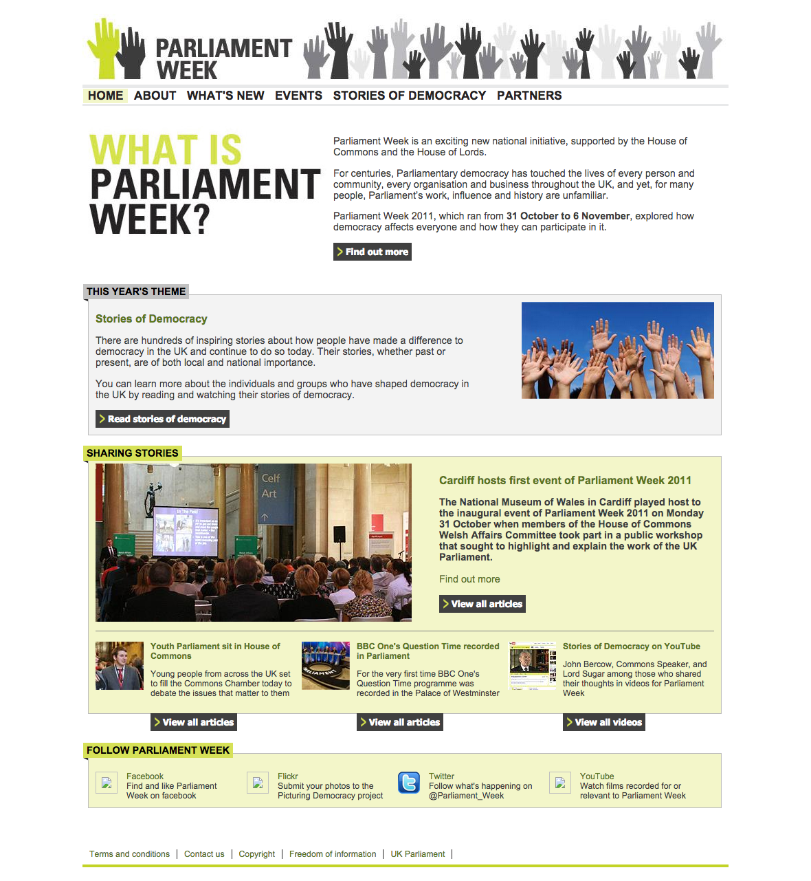
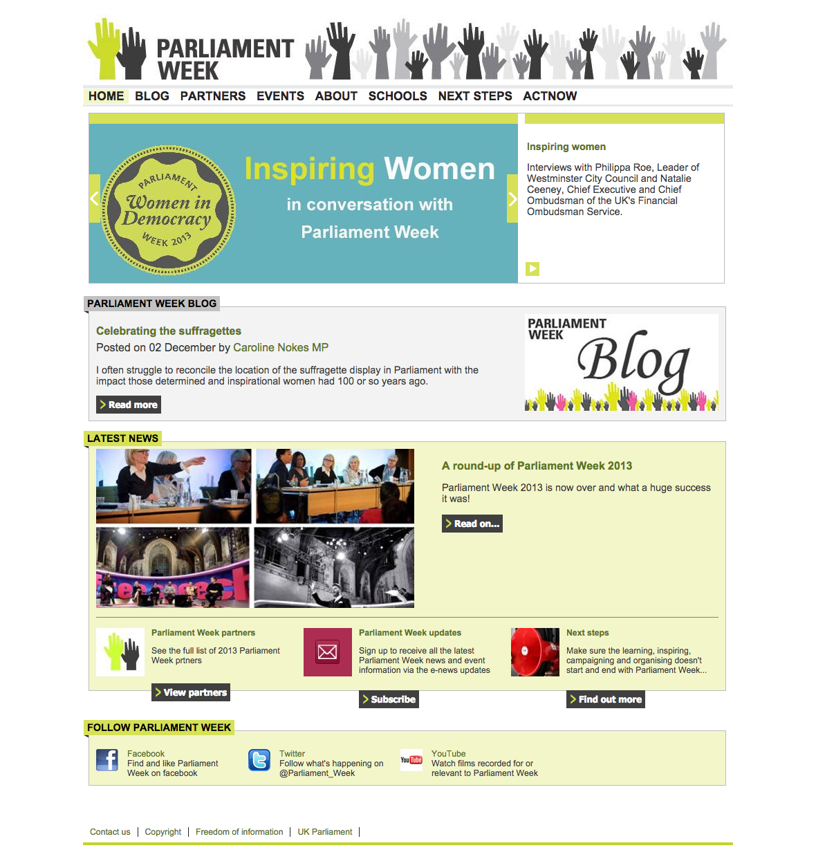
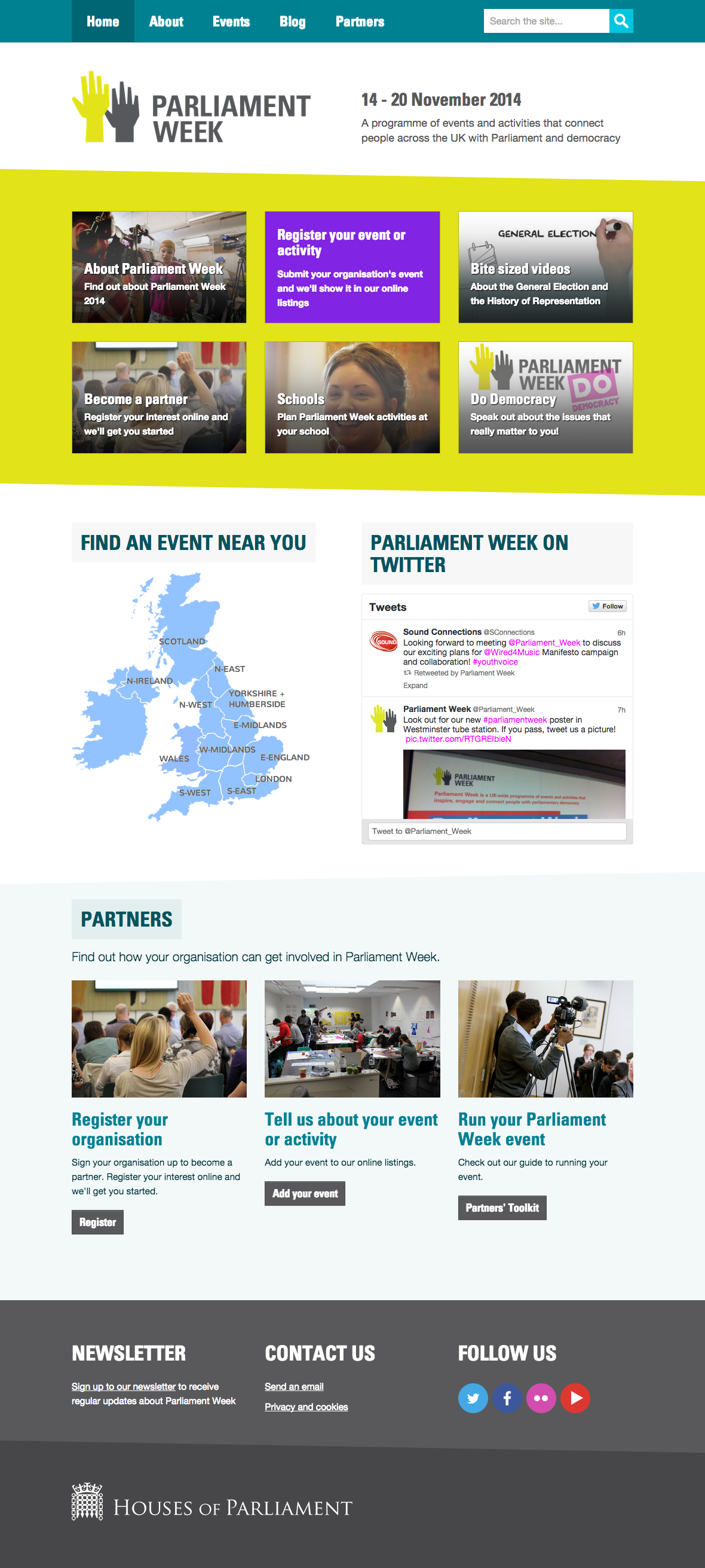
Here are some snapshots from the Wayback Machine for the past 3 years:

After our first meeting with the team, our interface designer drew up some wireframes to illustrate our proposed layout and functionality for the new website. After we discussed these with the PW team, we agreed appropriate changes and built a working prototype in WordPress, which we tested with members of the public. We made changes based on the results and then applied new visual designs to the prototype site, used for a second round of user tests.
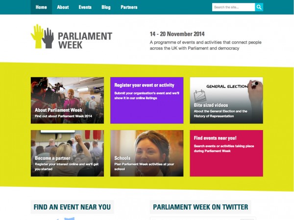
Homepage
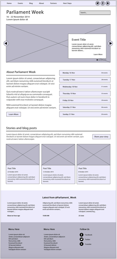
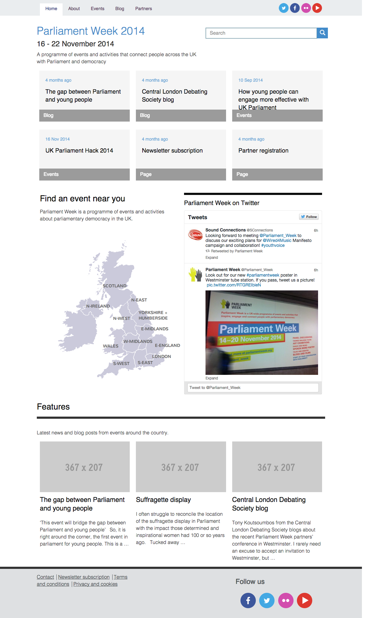
We designed the new homepage wireframes, copying the carousel from the old site, with space for a full-width image to highlight events. The team wanted partners to be able to submit their own events on the site. With hundreds of events anticipated, expecting partners to upload a high resolution image in large enough dimensions to fit a big desktop screen, was a little over-ambitious on our part. And we don’t like carousels, anyway. So we replaced this main section of the homepage with metro boxes, which we had used successfully on other websites. I think that using fixed boxes is better than a moving carousel. Boxes show everything at once. They don’t move without cause.
After the first round of user testing, the PW team wanted to make it easier for partners to get on board and so for the second round of user tests (with the visual design in place) we replaced the space for blog posts with an area for partners. There wouldn’t be many up to date blog posts on the site when the new site launched.
We also made a few usability tweaks. Some people didn’t scroll. They thought the top 6 boxes were the homepage. This didn’t happen in the prototype testing, but the boxes in the visual design appeared in a solid band of colour and on desktop monitors, it filled the screen nicely, but some people didn’t realise that there was more beneath. With a bit of resizing and some jaunty angles, this improved in subsequent tests.
Events
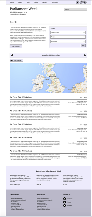

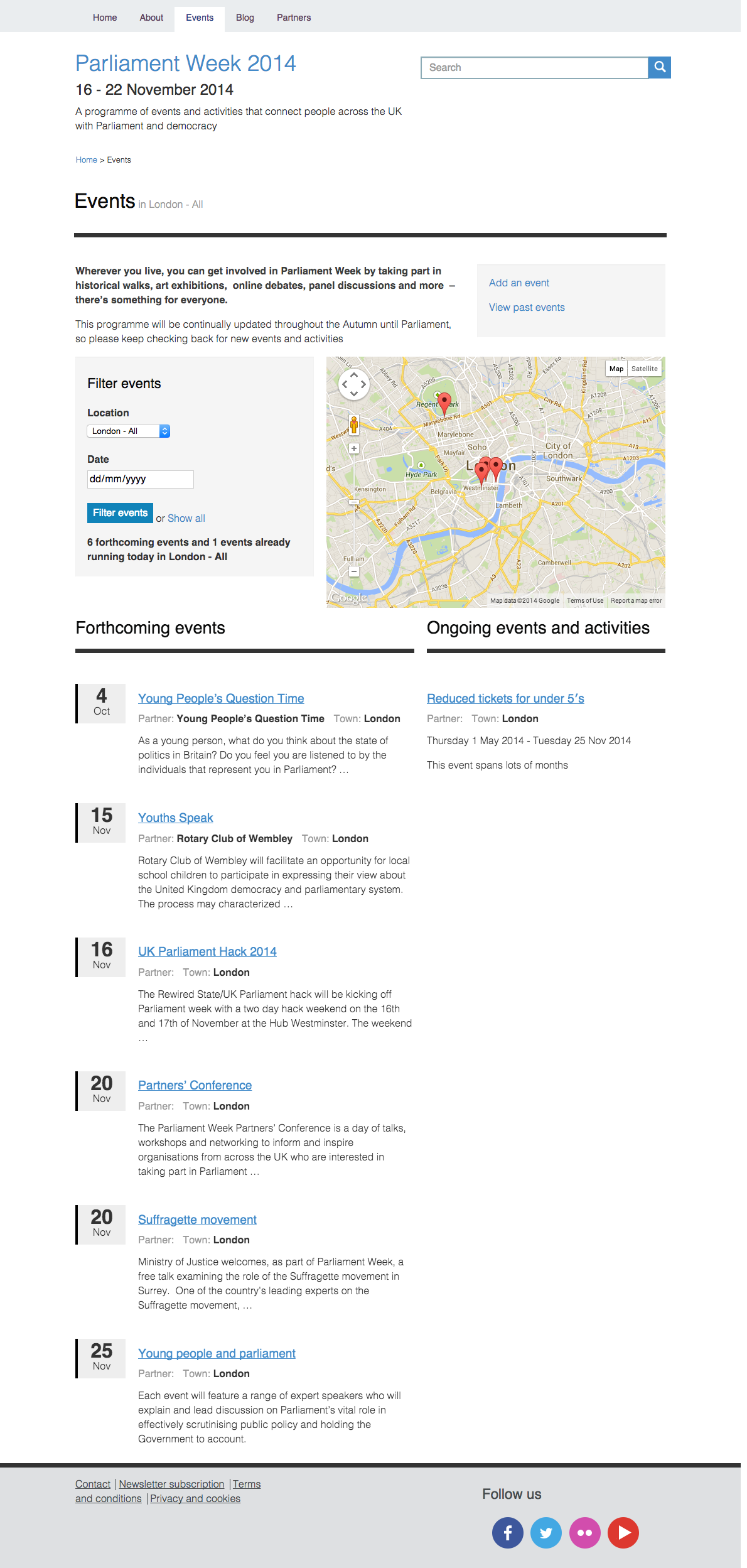


The wireframe of the events page contained a full-width, interactive Google map. We used this in the first rounds of user testing. It soon became clear that people had trouble scrolling. With a wheelie mouse, people got stuck while trying to scroll the page and ended up scrolling the map and making it zoom in and out. We rearranged the layout for the second round of user tests.
We also needed to come up with a way of showing events that didn’t last for a single day, but which straddled days, weeks or even months. But Parliament Week is only on for a week, I hear you say. However, some organisations have longer promotions that last for a month or two before the actual week. So we split the events listing page into 2 columns showing single day events on the left and longer events on the right. Single day events list in date order and as events pass they will drop off into the archive. Longer events list in order of those ending soonest.
The interface allows people to filter the events, down to a single day. In this case, the left hand column shows all the events on that day and the right hand columns shows all events which are taking place on that day but which might have started weeks earlier or finish days later.
And we had the same issue as the homepage with the “below the fold” problem. After filtering events on a location and getting the results, people thought that the map next to the filter criteria was all that was available. They didn’t scroll down the page to see the resulting list of filtered events. The positioning of the results area felt like an end of page boundary. Again, a bit of resizing and literal signposting improved this.
I thought “below the fold” had gone away. I thought we didn’t have to worry about that golden line any more, because people scroll. And of course, they do. But it just shows how design can either help or hinder the user flow depending on the cognitive aspects.
Event submission form
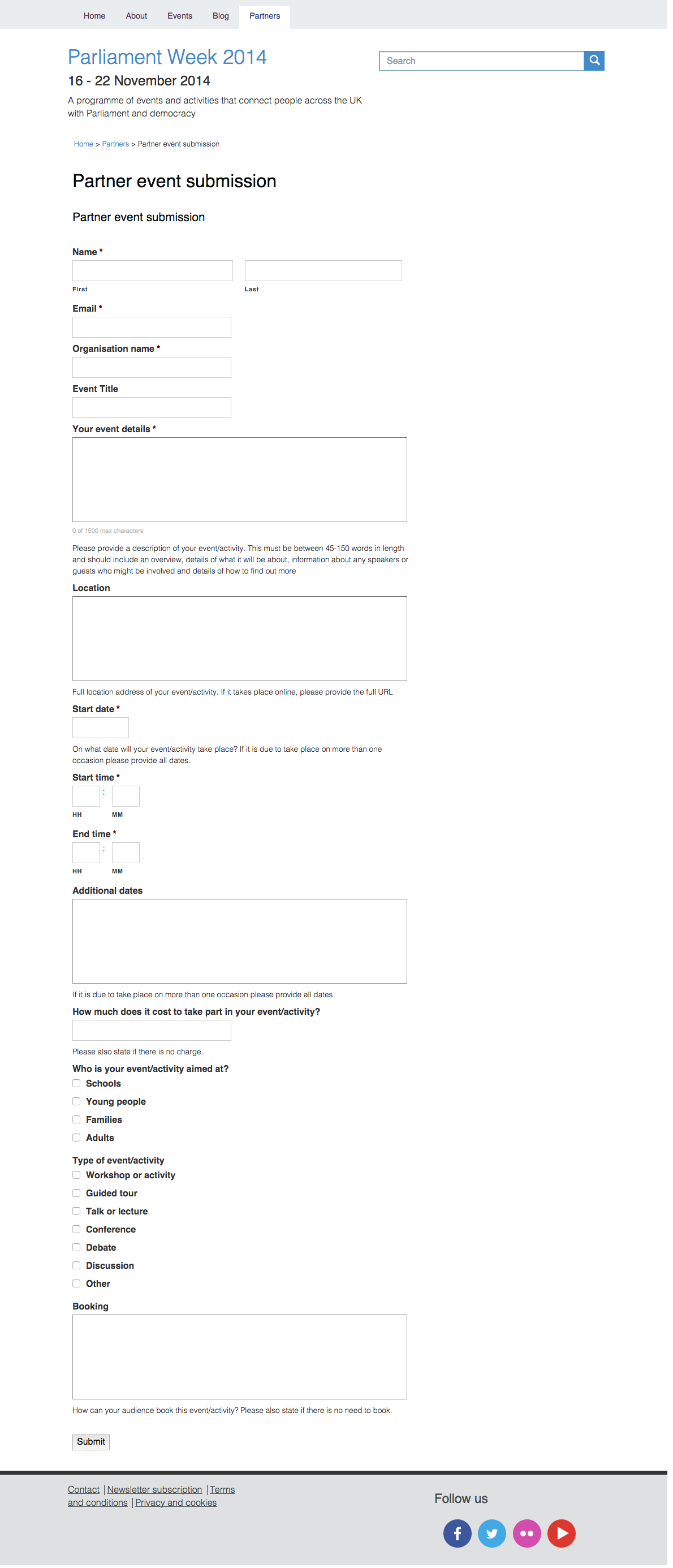

In the initial round of user testing, people needed a little more help with filling out the form. They made incorrect assumptions about the address, entering their organisation address instead of the event venue and they were confused about dates. The new form, while having more text, aims to be more helpful.
After launch
The Parliament Week 2014 website is now gathering momentum with under 2 months left until the week of events this year. We launched with a few events already in place and it has been satisfying to see new pins appearing on the events map as partners sign up and submit their events.
The online partner registration and event submission forms are streamlining the former administrative processes. The team now just have to tick a box and publish an event. They can export up to date spreadsheets of the data. And notification emails are handled automatically.
And the team will soon be reaping their value for money rewards again, as we work with them to reuse the custom WordPress theme for a similar website, saving substantial development time and having learned a few lessons along the way. This time the website is based around tea parties and commemorating 800 years since the Magna Carta – ‘The Great Charter of the Liberties of England.’ Hurrah!