If you haven’t taken steps to make your intranet accessible, you must take action before 23 September 2020.
Deadline for compliance
The Public Sector Bodies (Websites and Mobile Applications) Accessibility Regulations 2018 came into force on 23 September 2018. Organisations have had nearly two years to prepare for the deadline. While the focus has been on public websites and services, intranet and extranet sites are not exempt.
Tough times ahead for document-based intranets?
So it’s time to get your internal website up to scratch. Trouble is, when your internal website is just a gateway to a document file sharing system, you’ve got a big job on your hands to make all those documents accessible.
It was so easy at the time to just ‘Print to PDF’ and upload to the intranet. But if you didn’t take the time to check your heading structure, specify sections of content and add alt tags to images within your PDF, then it’s back to the drawing board. Better hope you held on to the original Word document that you used to create the PDF. What do you mean you thought it was stored on the intranet? The intranet is not your document management and versioning system!
The law and HR
Accessibility is nothing new. The Disability Discrimination Act 1995 and then the Equalities Act 2010 have both covered accessibility.
Back in 2004 I was part of an award-winning team for the work we had done on the London Underground intranet to improve accessibility. Jump to 2020 and I still have to point out accessibility issues and lobby for accessible content with HR departments.
Even within the last week, I’ve had to sell the GOV.UK website method of breaking up guidance into smaller chunks and making available as HTML pages. HR teams still counter with their legal responsibility to publish their complete policy in a PDF document.
They actually expect you to wade through pages and pages of their employee benefits document, past the vanity pages and the mission statement, past the pensions, sick pay, health scheme and death in services benefits, just to find out how to claim some childcare vouchers. Is that what you expect of your intranet?
Yet the same HR departments neglect their legal responsibility to make that content accessible. It’s ironic, because in forcing their requirement for a PDF, they put themselves at risk of legal action based on the Equalities Act.
This is where accessibility crosses into usability, because accessibility is not about taking the necessary steps so that your website can be used by people with visual or physical impairments; it’s about making content accessible to the widest audience possible and removing barriers to access.
The Portable Document Format
PDFs are generally barriers to access. You should only use them for content that needs to be downloaded and printed, such as glossy brochures or forms that need to be completed by hand. They are not a substitute for a well-structured HTML guidance page.
See Nielsen Norman Group guidance: Avoid PDF for on-screen reading
I have seen PDF documents with one paragraph. Linked from an HTML page that contains a hyperlink to the PDF. It’s madness. But for some people, that’s what their intranet is; a growing accumulation of unorganised folder structures and lists of links to documents.
Accessibility Bloopers Hall of Fame
And now the deadline to comply approaches. If you’re new to accessibility and managing content on an intranet, here are some examples of the top bloopers and common rookie mistakes that will break accessibility:
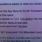
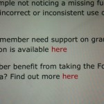
Click here
A selection from my screenshot archive of bad hyperlinks.These are all public websites or apps, but the same bad habits are prevalent on intranets.


Headings
There are two groups of perps.
The first group isn’t aware of HTML heading tags. These publishers just make text bold, sometimes underline it, sometimes set a larger font size, change the colour or make it all-caps to signify a heading.
Screen-readers will not notice these ‘headings’. Users will confuse underlined text with hyperlinks. Using all-caps is an offence punishable by hard labour at a your nearest ‘writing for the web‘ bootcamp.
The second group is the publishers who use HTML headings to suit their aesthetic tastes. Heading looks too large? They’ll switch and swap HTML heading tags until they find a size that is more to their liking. Screen-readers will mistake the structure of the content or not notice the structure at all.
Images
These days, it’s all too easy to drag and drop an image into content, crop and resize it until you’re happy with how it ‘looks’. But no alt tags on images means that your page won’t meet the accessibility checkpoints, and default alt tags such as ‘IMG4044.JPG’ are not helpful.
Images containing text, especially long phrases, need a text equivalent. Small thumbnail images or images viewed on a mobile device may be difficult to read if they contain text.
Animated images
Animated GIFs. They’re amusing. The first time you see them. They might make you trend on social media for a while. But when they are constantly rotating in a corner of your intranet homepage, they’re a pain.
The GIF format, like PNG, is an excellent format for compressing file sizes for images that contain a small number of flat colours – that is – not photographic or video content. It is the worst possible choice for serving video media.
There are no controls to stop, pause or play. There is no facility for closed captions. The best you can do is provide a text equivalent. But, you know, the humour gets lost in translation.
If you’re interested in saving the planet from climate change, just stop and listen to your computer, hear the fan bursting into action, feel the processor heating up when you’re next browsing GIPHY for animated GIFs. Sorry, but they are just not accessible. And they’re not good for the environment.
Tables
Again, two groups of offenders in this category.
We have the people who use HTML tables to layout their page, perhaps to create two columns or to line up images with a block of text. Accessibility rules state that tables should only be used for tabular data. This is not tabular data.
And then we have those who do use tables for tabular data, but fail to mark up the tables with appropriate HTML tags and attributes that will make it useful for a screen-reader. Tables without titles and column headings may be ignored completely by a screen-reader.
Colour
Colour contrast on the web is easy to check. I use the WebAIM colour contract checker and there are many others available.

Need help?
If none of the above made sense, if you fall foul of any of the top mistakes, if you don’t know why these bloopers are bad for accessibility, please get in touch.
Agento Digital can provide accessibility training and accessibility audits.