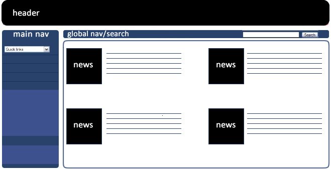
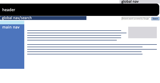
I have been meaning to write up the phases of our intranet redesign project for a long time. I’m going to blog the 6 phases of the project leading up to launch on New Year’s Day 2010. The project took around a year and a half to complete, with a core team of 4 people, working in addition to our day to day jobs of intranet publishing, website builds and the usual internal comms intranet panics. This was a major overhaul project, aiming at a big-bang relaunch.
Phase 1
This initial phase of the project produced a brief containing the aims, scope and deliverables for the project plus a detailed research analysis.
Usability review
Alongside my own usability review, I looked at our existing IBF usability benchmarking reports to feed the expert evaluations into the brief.
Due to multiple homepage redesigns, the existing homepage was inconsistent with lower-level pages, which had retained their original templates. The menu colours and layout were different, the header bar was different. The fonts and layout were different. The main navigation on the homepage promoted navigating away from the intranet and sections which were not the most popular in terms of user tasks. Staff did not understand the four categories of news stories (corporate, media related, staff interest and feature news.)


Behind the scenes, the folder structure was haphazard, as was filenaming.
Analytics reports and search logs
I analysed the analytics and search logs to find out which content was popular, unpopular, surplus or missing. I looked at page views, time on pages and search phrases. This analysis gave me a good idea of what the staff were browsing and searching for. No prizes for guessing the top pages: job vacancies, forms, people search, pay information. At that time we didn’t have a restaurant menu; missing content!
Gerry McGovern, Customer Carewords and contextual navigation
We used Gerry McGovern’s Customer Carewords methodology to survey staff with the objective of finding out what they wanted to do on the intranet in terms of top tasks.
Around the same time, I tuned into a webinar that Gerry was hosting in which he talked about contextual navigation. The practice of only showing menu options relative to the page content. He talked about how the BBC website used this technique and demonstrated how menus adapt, for example, from sports, to football, to first division football without still showing cricket or tennis. I made a note to experiment with this.
Stakeholder interviews
We spoke with stakeholders from across the organisation with particular emphasis on internal communications. There were lots of detailed discussions about news and how we were going to present news articles. The current 4 categories of news needed simplifying.
Brief
Having looked at all the evaluations, research, stats and surveys, we developed a basic brief, summarised below:
- Improve the overall site design and layout (modern look and feel, improved readability and ease of use)
- Use the internal brand
- Redesign the information architecture by auditing and recategorising content
- Implement a simplified navigation system (test contextual navigation)
- Simplify the news categories and improve delivery
- Rectify the flow of stories from the homepage to news archives
- Redesign the search results interface
- Overhaul intranet content metadata to give a solid search experience
- Standardise folder structure and filenames
- No end date! Project Manager nightmare! But we knew that we would have to work on the project alongside our day jobs (where anything can happen!) and only decided on a launch date as we prepared for content migration (phase 5).
In this series
- Research, surveys and brief
- Information architecture and content audit
- Wireframe designs and user testing
- Visual design, HTML and CMS build
- Migration, content freeze/dual publishing
- Communications, launch and evaluation
