I’ve been following the progress of Devon County Council’s new intranet build and was pleased to hear news that the beta version was launching.
@Tom_S_Dixon gave us a preview of work in progress at the GovIntranet Club meeting in January, via a rather one-sided Google Hangout; we could hear and see Tom on the display at our end, but Tom was presenting to a blank and silent screen, while heroically keeping up with my hurriedly-mistyped chat message updates.
Despite the technical problems, we were treated to an ample preview of the work in progress. I was pleased to see that the team had opted to go with the “How do I?” approach for guidance content, and a minimal set of main menu navigation choices. Tom told us about the ambitious plans for the site to be public, not hidden behind a firewall. And more recently, I’ve been somewhat taken aback at the news of AAA accessibility rating.
V impressed that #govintranet theme meets WCAG 2-AAA 'out the box' – our beta staff pages go live next week #dccdigital @Luke_Oatham
— Tom Dixon (@Tom_S_Dixon) April 12, 2017
Rachel Miller @AllthingsIC caught up with @paulamiles37 about the hows and whys of the new intranet:
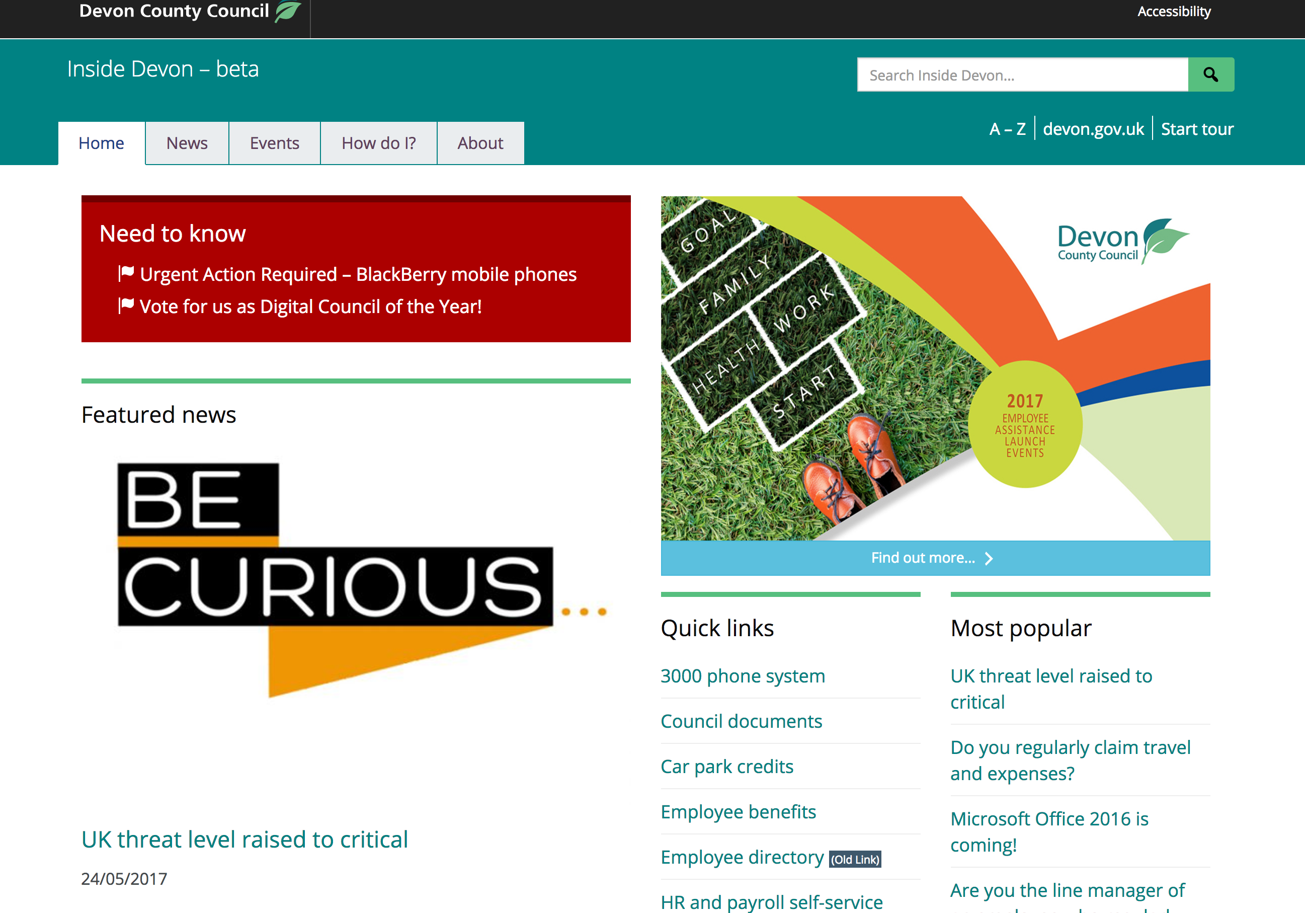
Keeping it simple
I know how difficult it can be to fend off requests for extra menu options and additions to the homepage, or resist the temptation to just publish something because it’s easier. But without a solid strategy for handling ongoing publishing, intranet homepages and menus can soon become unmanageable.
I was recently reacquainted with a departmental intranet that I last saw three years ago. It launched with a standard minimal set of main menu navigation options. It now has 16 main options. Some of these top-level options open links to websites in new windows; some link to “under construction” pages. A good proportion of the 16 items are labelled with two or three long words. There are so many wordy items that the menu items stacks up into three rows of header space on a desktop display, and four rows on smaller displays.
I’ve followed other intranets that have launched with a standard homepage layout of news on the left side of a desktop view, with important news prominently displayed. Access to trending intranet guidance and commonly used internal systems and services generally start in prime position at the top of the right-hand side of the homepage layout. And then as time goes by, these helpful features sink inexorably lower down the page, demoted in favour of links to HR, yet more news, and headshots of senior staff that linger for weeks on end.
Inside Devon is keeping it simple. As I write, the homepage maintains the tried and tested news and top content combo layout. The homepage isn’t a mile long list of internal communication announcements. The team are making use of the “intraverts” module. There’s an announcement in the top-right hero area of the homepage, touting for me to click it. If I do click, it will take me to somewhere else on the intranet, and will disappear from the homepage, for me, making room for the top tasks when I return.
Points to watch
I’m not too keen on ‘Quick links’ as a label for a list of links. I often see examples of this in various guises; useful links, fast links, helpful links. Might as well be called yellow links or happy links. Commonly, this is actually a group of links to other websites, systems and services that exist outside of the core intranet. I’ve been trying to encourage intranet managers to find more meaningful names for these groupings.
And I’d keep an eye on the automated “most popular” links on the homepage. I can see that the site uses this widget to effectively promote popular guidance on the How do I? page, and trending stories on the News page. On the homepage, it looks like this has been configured to include news stories. In my experience, as fresh news stories are published, traffic to the stories causes them to bubble up into the most popular list and over time, the popular list tends to echo the stream of main news, creating two lists of identical links on the homepage.
But I’m nitpicking over things that are not big issues…
Search results
I tried my standard set of search queries that I use for central government departments, not expecting all of them to be relevant.
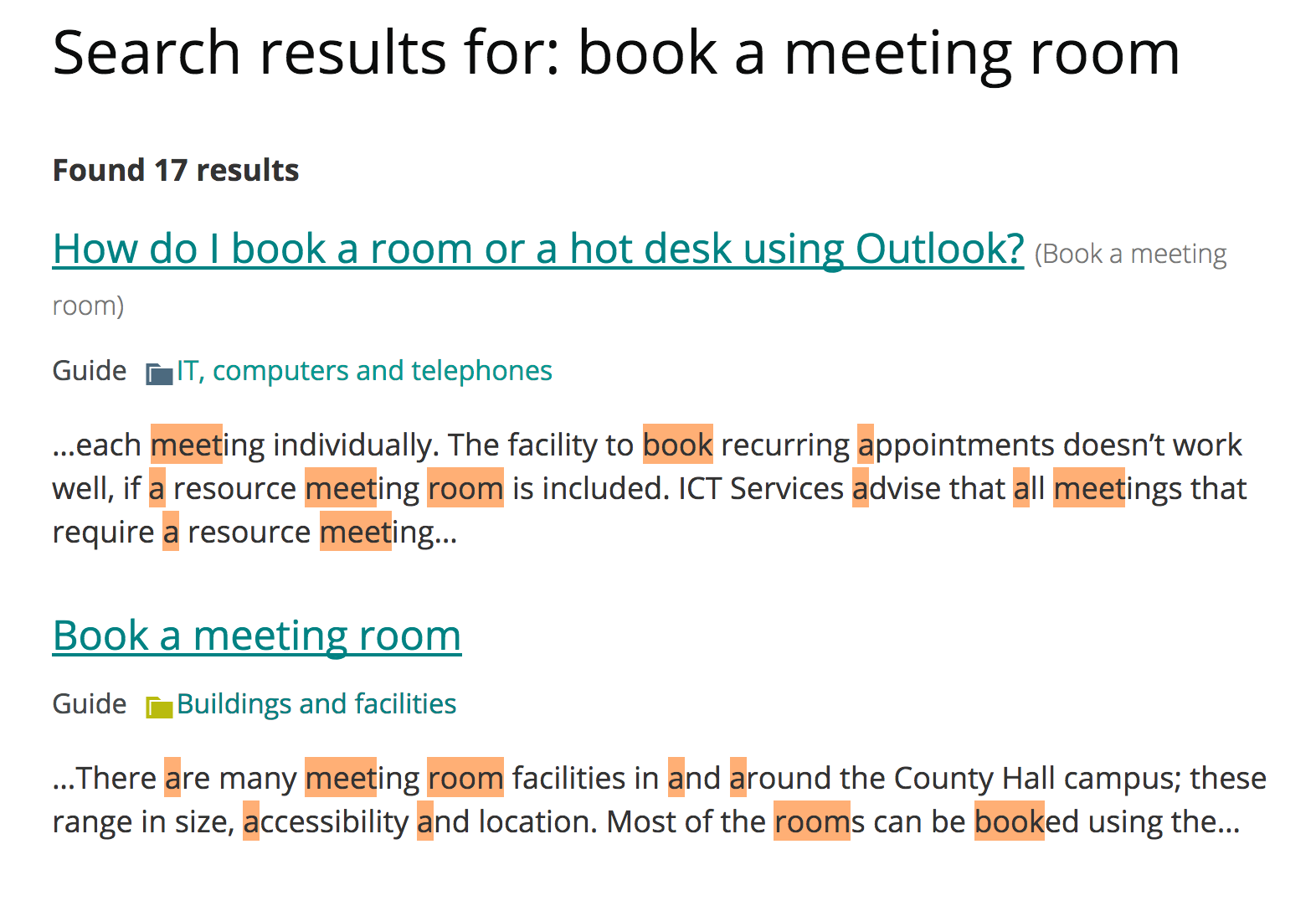
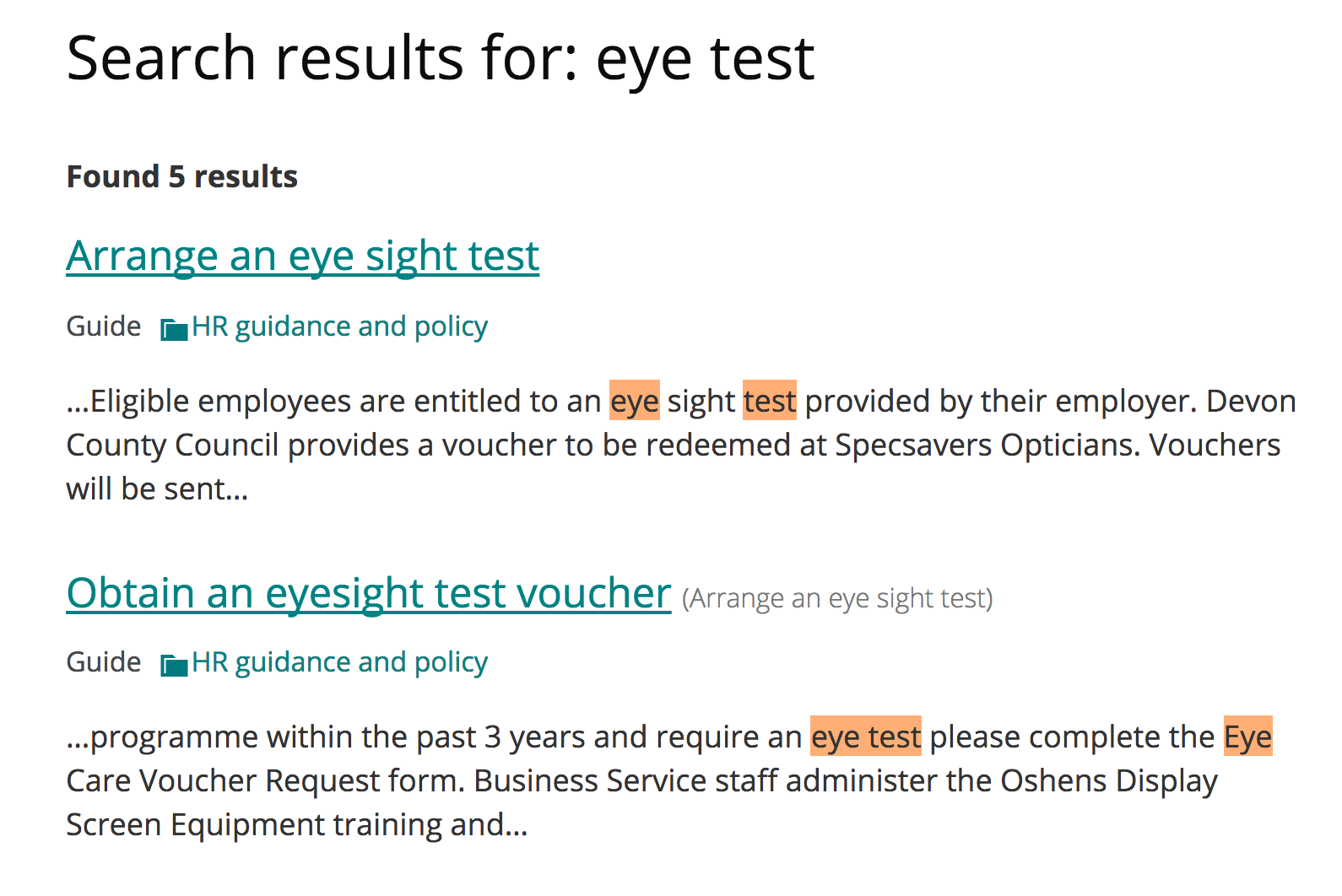


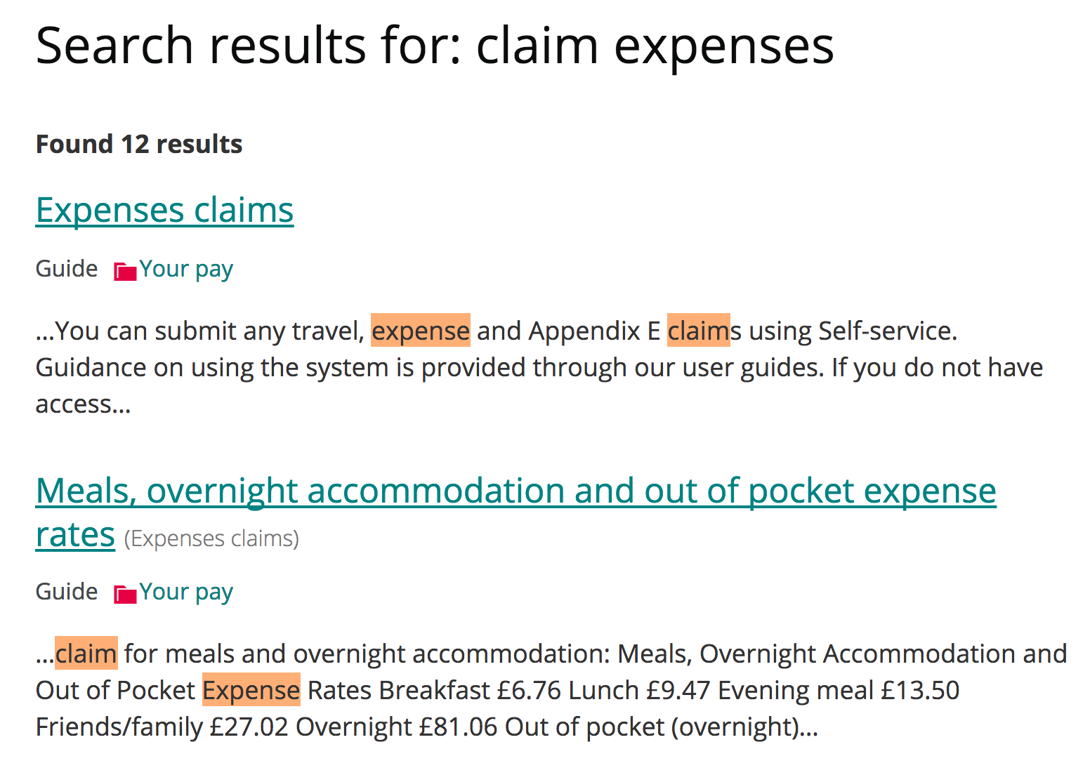
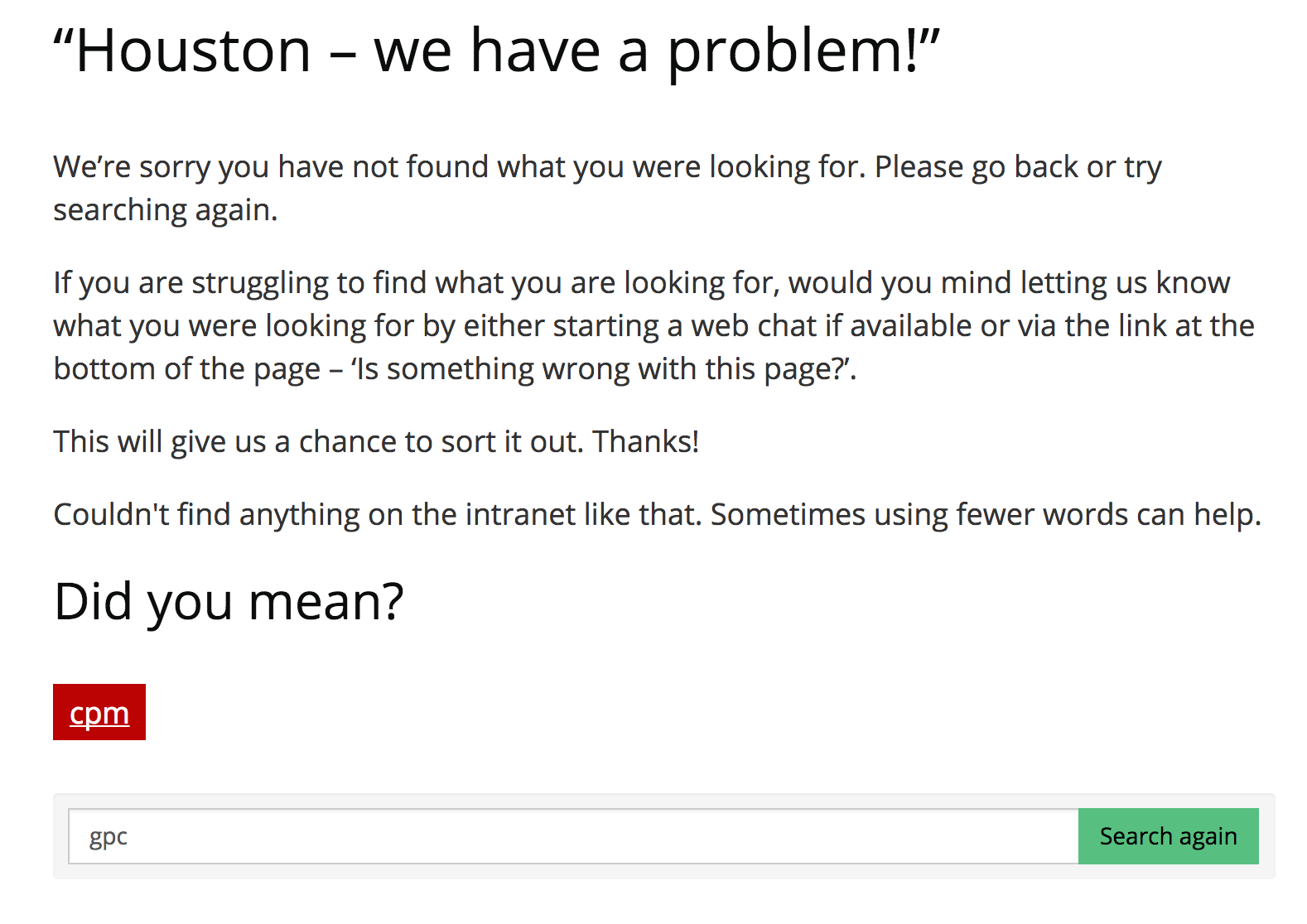
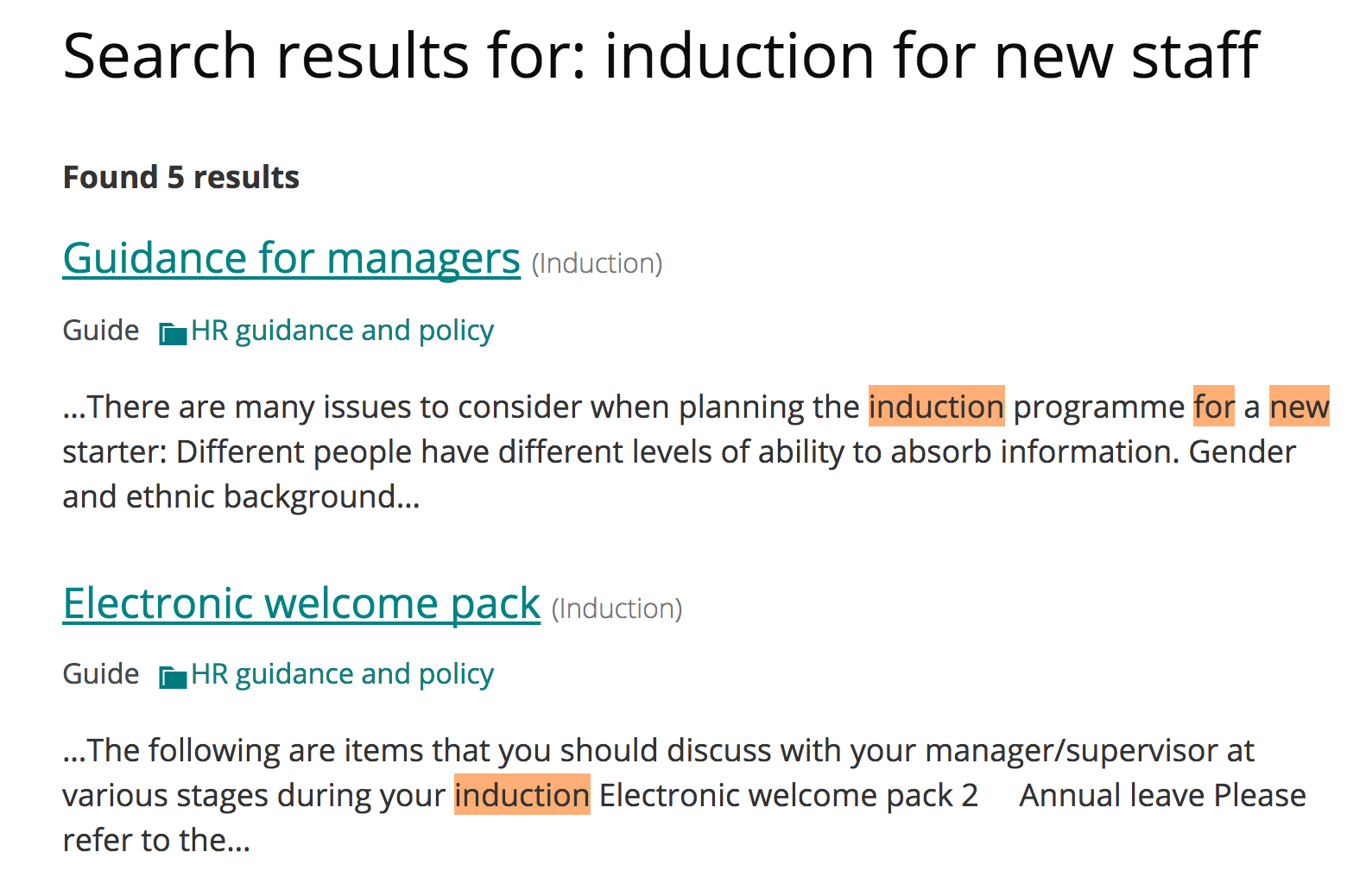
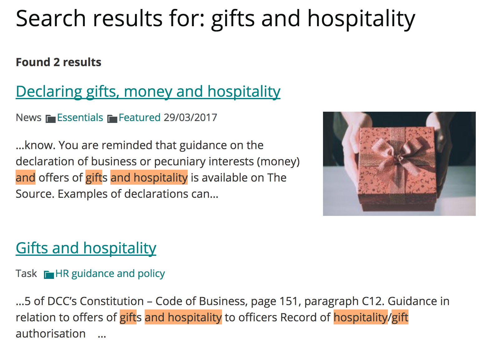
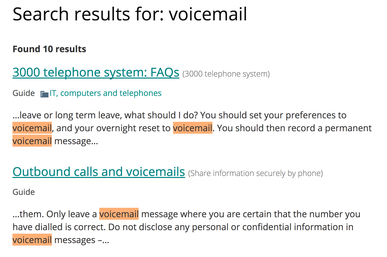


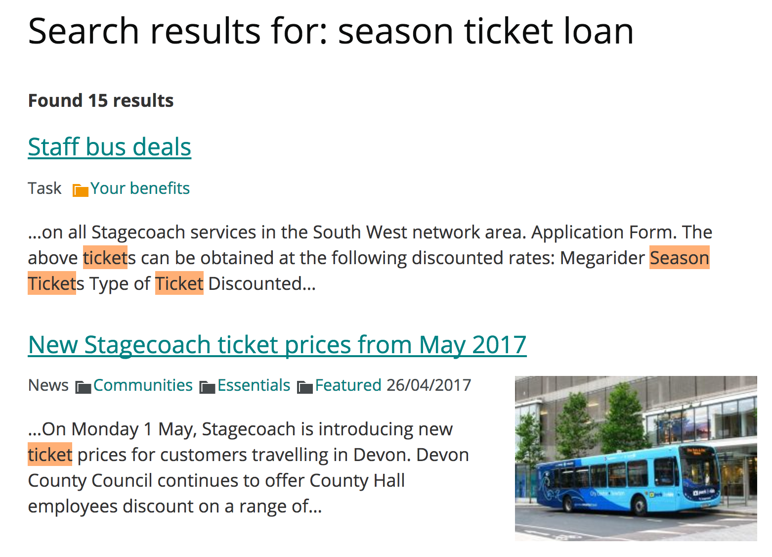
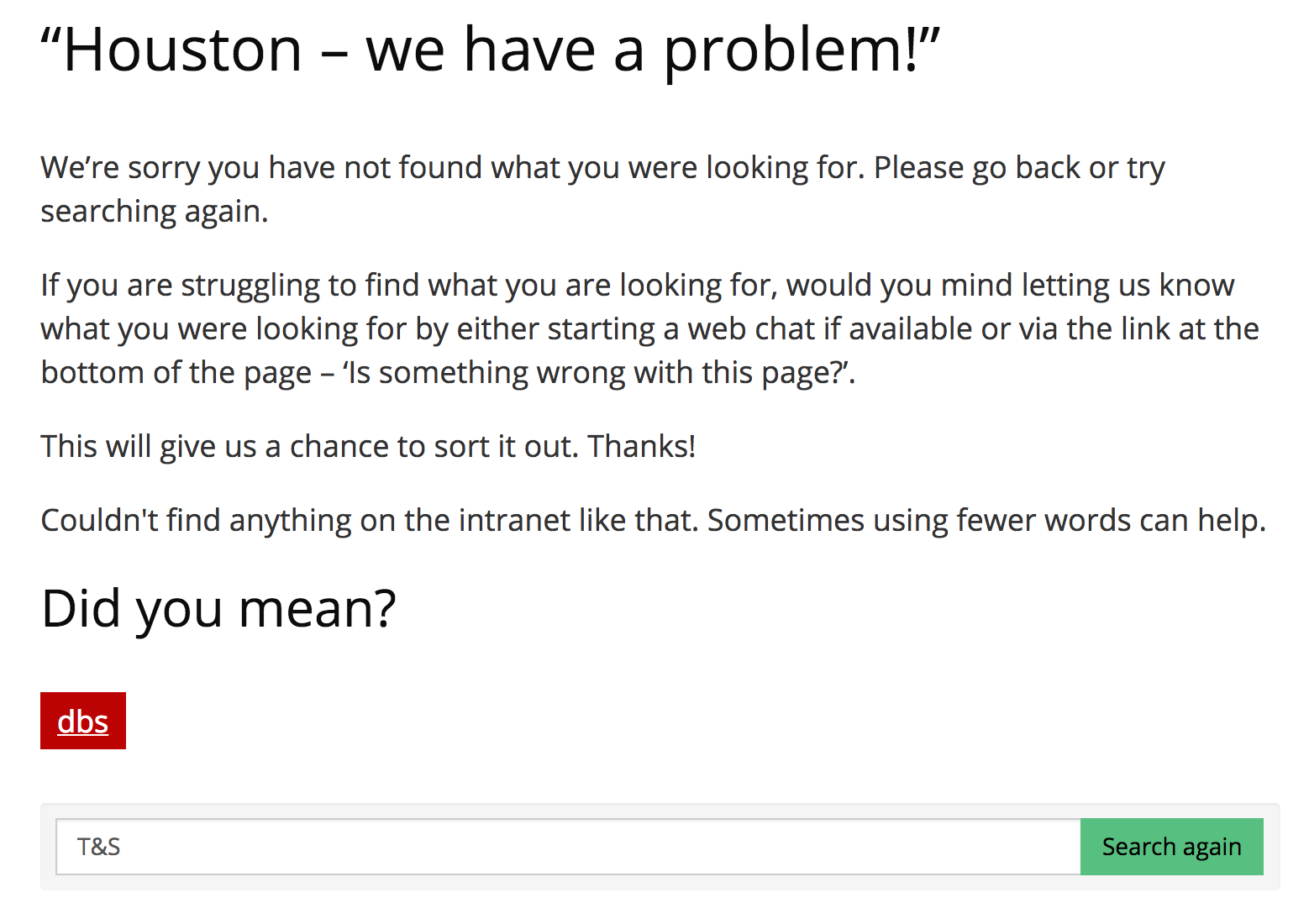
These are great results. I know it’s early days for the content on the intranet, so fewer results are being displayed, but the search results pages aren’t unmanageable. There are few results per query and the desired results are showing at the top. It looks like documents are being excluded from search results, which I would encourage. I’m still not too sure about the “helpful search” feature, which takes you directly to a page if there is only one search result for your query. It sounds good in theory but it’s a bit of a judder to the user experience. I hope to get some useful feedback on this feature.
Internal and external crossover
It’s refreshing to witness the team forging on with the public site as planned. It’s all too common for the IT security and information assurance people to slam on the brakes as soon as they hear the words intranet and public in the same sentence. In their world, an intranet is an area of space on an internal network, totally cut off from the internet and the outside world, chiefly existing as a place to store documents, available only to employees chained to a desk in an office.
Congratulations to DCC on opening up and thanks for sharing.
More search result tests