Familiarisation
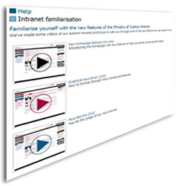
To help staff become acquainted with the new look and feel and functionality before the launch, we published a set of *intranet familiarisation* videos, using the new intranet template, and linked them from the existing intranet via a feature story.

In the month before launch we scheduled several intranet feature articles detailing the forthcoming launch. Our in-house design team created a flyer insert for our monthly staff magazine and we let our stakeholders know through email bulletins and newsletters. We published a final intranet article as we broke up for Christmas holidays saying bye bye to the old intranet.
Launch
I was very proud to press the button on New Year’s Day which would set the CMS in motion, publishing the new homepage, the news section and linking to all newly migrated content. It was then time to sit back and wait for the response from staff.
We had managed to migrate all of the content except for some older news stories and we were busy pedalling away in the background as the new intranet went live to staff.
Post-launch
There was an eerie silence after the launch. Business as usual. No cries of joy and no rotten tomatoes. Staff were just getting on with it. Hopefully our comms and familiarisation helped to bed them in a little.
Evaluation
The average time spent in a visit to the intranet has fallen from an average 2 mins 30 down to 1 min 20 since the launch. We’ve almost halved the time that staff take in a typical visit to the intranet. I’m optimistically reading this as evidence to show that they are finding and digesting information faster. Hopefully the improved navigation, legibility and layout are having an effect.
Uptake for feature news has almost doubled since the launch and is steadily rising. All the time spent in planning the news delivery was worth it.

Around 3 months after launch, we evaluated the *usability and design* benchmark as part of our annual IBF review. We also used Customer Carewords again to run the intranet staff satisfaction survey. See my previous blog posts for the results:
Evolution
Since launch, the intranet has changed and adapted, due to requests for new content and campaigns, issues highlighted by analytics reports and recommended actions from benchmarking evaluation reports.
One glaring problem that came out of our benchmarking report this year was that although I had done a lot of testing with the navigation to ensure staff could find their way around the intranet, I had not paid so much attention to the task of downloading a document. In the new intranet, downloads such as PDF and DOC files were listed in the right hand column. However, staff (rightly so) saw this column as links that would take them elsewhere – *related information*. As a result, they often missed the links to the documents. So we’ve been working to remedy this, moving download links to the body section of the page, in context.
I feel now that the intranet has reached a level where further enhancements can dripfeed through, rolling out small improvements and developments one at a time. Although the intranet is alive and constantly changing, this redesign project gave it a much needed kick in the butt to bring it into a state where no further big bang launches are necessary.
Other intranets within the organisational group have adopted the new design template and this is a good first step in providing a unified experience across our family of intranets.The intranet has come a long way, but work doesn’t stop. There is always room for improvement, as well as trying to keep up with what’s happening out on the web and constant changes and restructures within the organisation. I blogged previously that we are currently working to introduce more engagement functions on news stories, including *Like*, *Share this* and *Comment*.
I’m aware that we don’t have a true task-based navigation system and that several sections still hang off the departmental structure. We have no proper social functions on the intranet because we don’t have the technical architecture or platform. We have *strap-on* sites such as Huddle and Civil Pages but they don’t talk to each other and they don’t integrate with the intranet. We still have the most useless employee directory, again not integrated into the intranet or any other systems such as Outlook. And I’ve been waiting over a year (or is it two?) for our Google Search Appliance upgrade.
So plenty to get on with.
For now, that’s the end of this budget intranet redesign series.
Thanks for all the mentions and RTs over the past weeks.
